Showing posts with label health care topic. Show all posts

Thursday, August 11, 2022

How to measure your blood pressure

Why blood pressure measurements at your doctor's office are imprecise

The blood pressure measurements you get at a doctor's office may not be representative because:

1) In a doctor's office you are nervous, and that can cause blood pressure to spike;

2) They typically take just one single reading.  Blood pressure is volatile.  You need to take at least 3 measurements and take the average to derive a more representative measure of blood pressure; 

3) It is critical to take the blood pressure on each arm.  The blood pressure in each arm is different.  And, this difference is informative.

Blood pressure standards.  The ones from the NHS are pretty good

Unlike American standards, the UK's NHS does not go crazy the minute your blood pressure is over 120/80.  Also, the NHS is concerned about low blood pressure.  American standards typically are not, a material omission. 

So, here are the NHS blood pressure standards.

Take 3 measurements in each arm, and observe the difference between arms

Next is an example of a basic blood pressure reading (3 measurements in each arm, and calculating the difference between the arms, and the averages). 


 The above overall average blood pressure is 130/83 which falls within normal range (NHS).  When we look at the data for each arm, we notice a very large difference between the two arms.  It turns out that this difference is very informative.  The table below discloses the interpretation of this difference.

The difference between the arms tells you what type of cardiovascular condition the patient may have, what event he may incur, and what is the location of the blocked vessels (the side with the lower blood pressure).  

When I use "may" it indicates the statement is uncertain.  It is not deterministic.  But, the blood pressure measurements inform the cardiologist on what test to conduct to confirm the presence of the mentioned condition.   

Next, look at the difference between Systolic and Diastolic pressure

The difference between the systolic and diastolic pressure is called Pulse Pressure (PP).  The ratio of the PP divided by the systolic pressure (PP/S) is also of interest.  Let's take an example. 

The table below discloses the interpretation of the PP metrics.  Notice the frequent use of "may" conveying uncertainty.  However, it suggests the PP information can raise hypotheses regarding numerous cardiovascular ailments.

The described patient has good pulse pressure measurements which do not raise explicit concerns. 

You may also consider observing the difference between arm and ankle blood pressure

The difference between your arm and ankle blood pressures is the ankle-brachial pressure index (ABPI).  This measurement requires special equipment conducted in a doctor's office.  For more detail on this test, check Wikipedia.  

Nevertheless, I would venture that taking 6 measurements at home (without the precise equipment) may be as representative as taking one single measurement at a doctor's office.  

See below the table interpreting the ABPI (source: Wikipedia). 

An ABPI between 0.90 and 1.29 is considered normal, free from peripheral vascular disease (PVD), while a lesser than 0.9 indicates arterial disease.   

An ABPI of 1.3 or greater is high, and suggests calcification of the walls of the arteries and incompressible vessels, reflecting severe PVD. 

How about the plain Pulse Rate... It is about Atrial Fibrillation

Blood pressure monitors disclose the pulse rate (heartbeat per minute).  On a stand alone basis, it is not informative.  However, the pulse rate is the marker for atrial fibrillation (A-fib), irregular, and rapid heartbeat.  If left untreated, it can lead to serious cardiovascular events and cognitive impairment.  For more details on A-fib, go to Wikipedia. 


So, how can you test yourself for A-fib?  Anyone who has a Fitbit, Smartwatch, or Oura ring can observe their pulse rate trend throughout the night.  Any spiking deviation in pulse rate will be readily noticeable.  And, it may suggest one has A-fib.  During the day, such measurements are less precise because any activity readily affects our pulse rate.      

Wednesday, February 2, 2022

Will we soon live to a 100?

 We are talking here of life expectancy at birth.   And, it represents the average (or probably the median) number of years one can expect to live when born in a given year.  This estimate is based on the current relevant mortality rate for each age-year.  

We already have centenarians now.  As a % of the population, the proportion of centenarians is likely to increase somewhat due to continuing progress in health care.  However, health care improvement may be partly countered by deterioration in health trends (rising diabetes, obesity rate, and declining fitness levels). 

To advance that in the near future we may reach a life expectancy of 100 is incredibly more challenging and unlikely than having a rising minority of the population reaching 100.  Here is why... for each person who dies at a more regular age of 70, you need 3 who make it to 110.  For each one who dies at birth, you need 10 who make it to 110. 

How about 90?  For each who dies at 70, you either need 2 who make it to a 100, or 1 who makes it to 110.  

You can see how the average life expectancy arithmetic is very forbidding. 

You can see my research on the subject at Slideshare.net and SlidesFinder.  

Live to a 100 at Slideshare    

Live to a 100 at SlidesFinder  

The above is a 35 slides presentation that is very visual and reads quickly.  Nevertheless, let me go over the main highlights. 

I looked at the life expectancy of just a few countries with very long life expectancy plus China and the US. 

                                                                                                                                                                           I observed an amazing amount of convergence between numerous countries that are geographically and genetically very distant.  These countries have also very different culture, lifestyle, and nutrition.  Yet, they all fare very well and have a converging life expectancy above 80 years old (several years higher than China and the US).  And, also several of those countries started from dramatically lower starting points.  This is especially true for Korea (South) that had a life expectancy much under 40 back in 1950.  And, now Korea's life expectancy is nearly as long as Japan, much above 80 years old


Next, I looked at the UN forecasts of such life expectancy out to 2099.  And, I found such forecasts incredibly optimistic. 

As shown, all countries' respective life expectancy keeps on rising in a linear fashion by 1.1 year per decade.  This seems highly unlikely.  The longer the life expectancy, the harder any further increase becomes.  The forecasts instead should probably be shaped as a logarithmic curve reflecting smaller improvements as life expectancy rises. 


I did attempt to generate forecasts for a few countries (Japan and the US) using linear-log regressions to follow the above shape, but without much success.  This was in part because the historical data from 1950 to 2020 is often pretty close to being linear ... just like the first half of the logarithmic curve above is also very close to being linear.  Maybe if I had modeled Korea, I may have had more success using a linear-log model.  But, there was no way I could have successfully used this model structure for all countries covered because the country-level historical data had often not yet entered its logarithmic faze (slower increase in life expectancy).  The UN forecasts entailed that if the history was linear, the forecasts would be linear too ... a rather questionable assumption.   

Also, as mentioned current deteriorations in health trends are not supportive of rising life expectancy...  especially life expectancy keeping on rising forever in a linear fashion.  I call this questionable forecasting method the danger of linear extrapolation. 

As shown below, the rate of diabetes is rising worldwide. 


Also, BMI is rising worldwide. 


This deterioration in health trends represents material headwinds against life expectancy keeping on rising into the distant future. 

The full presentation includes much more coverage on all the countries, more info on health trends; and it also looks at healthy life expectancy, a very interesting and maybe even more relevant subject than life expectancy.  Who wants to live to a 100 if it entails 30 years of disability.  Healthy life expectancy is what we really want.  At a high level, healthy life expectancy is typically a decade shorter than life expectancy.  For more detailed information go to the full presentations.    


Thursday, November 18, 2021

Is Japan indicative of the future of the US?

Japan leads the US towards a path associated with:
a) a decreasing fertility rate much below replacement rate;
b) an aging society;
c) a declining population growth;
d) a slowing economy; and
e) an increasingly leveraged Public finance position (large Budget Deficits, very high Public/Debt ratio).

However, the two countries are likely to continue diverging materially on several counts:


a) The US population growth is already declining.  But, it is likely to remain positive and much above Japan.  That is because the US benefits from a robust net migration of close to + 1.5% of the population per year vs. only 0.5% for Japan; 


b) Health status and healthcare costs metrics will likely continue to show Japan with far better health outcome associated with far lower health care costs.  This is in good part because of the inputs.  Japanese are far healthier than Americans.  And, these divergences appear likely to continue; 


c) Japan is likely to continue outperforming the US on primary school indicators; 


d) The US is likely to continue outperforming Japan on university level indicators and the generation of science and engineering degrees and papers. 


I have conducted a detailed analysis of all of the above that I share at: 

Study at Slideshare.net

Study at SlidesFinder  

I share these two different platform access options, as I don't know which one is easiest to access.

Below I am sharing just a few of the key slides of this analysis.
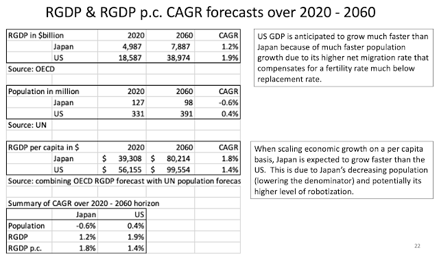
The slide below discloses that over the next 40 years, the US population and economy is anticipated to grow much faster than Japan, mainly due to the US higher net migration.  However, Japan's Real GDP per capita is expected to grow faster than the US.


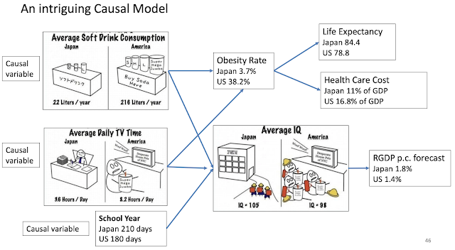
This next slide is an intriguing causal model.  It discloses that Americans drink a lot more soft drinks, watch a lot more TV, and have a far shorter school year than Japanese.  These three indicators may have causal implications on several health metrics: obesity rate, life expectancy, and health care cost.  They may also have implication in overall population IQ and prospective RGP p.c. forecast.

Below, I am just sharing a few references regarding the respective countries' IQ score. 


While the trends reviewed so far favor Japan, the next set of trends related to upper level education reflect a marked competitive advantage for the US. 

The US dominates the ranks of top universities. 


The US also produces a competitive number of Doctorate degrees in science and engineering. 


The US also publishes a competitive number of papers and articles in science and engineering. 


Saturday, October 30, 2021

Health care status and health care costs international comparisons

 This is a review on the subject leveraging the information provided by a presentation titled "Multinational Comparisons of Health Systems Data, 2020" by Roosa Tikkanen and Katherine Fields from The Commonwealth Fund. 

Among developed countries Americans are by far the unhealthiest with: 

a) obesity rates far higher than any of the other shown among OECD countries; and 

b) a far greater % of individuals with multiple chronic conditions.  

On a stand alone basis, an unhealthier population should lead to higher health care costs. 


Because of Americans worse health, the resulting American lifespan is far shorter than among any of the other shown OECD countries.  On a stand alone basis, it may cause health care costs to be relatively lower.  


Americans utilization of health care services seem relatively lower than other OECD countries.  On a stand alone basis, this should translate into lower health care costs. 

On a relative basis, it appears Americans utilize their respective health care systems much less than their international counterparts.  On a relative basis, this should lead to Americans incurring lower health care costs.  

The lower utilization is captured by: 

a) Average number of physicians' visits per capita; and 

b) Average length of stay at hospital.

In summary, if we combine all those factors together, based on the mentioned "inputs" we may expect American health care costs to be somewhat in line with other OECD countries.  In other words, Americans' worse health pushing health care costs upward may be at least partly compensated by Americans lower utilization pushing these same health care costs downward.  

So, next let's see how those health care costs compare.  No matter how you look at it US health care costs are a huge outlier and way higher than the ones of their OECD countries counterparts. 

Of additional concern is that these costs are growing far faster as a % of GDP than for the other countries.  Back in 1980, US health care costs relative to GDP were in line or close to the ones in Germany, and Sweden.  Forty years later, US health care costs relative to GDP are 45% higher than in Germany and 56% higher than in Sweden. 


As shown on graph below, per capita Americans spend a lot more than any of the shown OECD countries.


As shown above, the US Government funded health care costs at around $5,000 are pretty much in line with the other countries.  American out-of-pocket costs (funded by private citizen) is also not that far out of line with other OECD countries.  But, it is the privately funded costs that are way out of line with other countries at over $4,000 per capita vs. much less than $900 for any of the other countries.  

The cause for such high privately funded US costs are multiple.  They include: 

a) US Medical schools are far more expensive.  See comparative costs for a slightly different set of countries from the Medscape International Compensation Report 2019.  Many European countries not shown below have either free Medical schools or provided at a nominal cost. 

b) US doctors earn far more than their counterparts in other countries.  This is in part for their need to recover their much higher cost of education.  See comparative costs for a slightly different set of countries from the Medscape International Compensation Report 2019. 
 

c) The US is the most litigious society.  This is associated with very costly malpractice insurance premium and the need to practice "defensive" medicine which may lead to over testing to protect against malpractice lawsuits.

d) The US large private health care system is "for profit" driven by shareholder returns and other Wall Street driven economic incentives that are often conflicting with what is best for the patient from an effectiveness and efficiency standpoint.  This "for profit" system has also lead to a greater concentration within the hospital industry and related doctors' networks increasing the oligopolistic market price power of such entities. 

e) US regulations are often further exacerbating the private sector health care costs.  For instance, Government programs such as Medicare and Medicaid are prevented from negotiating for lower drug prices.  This is probably unique among OECD countries.   

In conclusion, the US is associated with: 

a) a far unhealthier population (is that just a worst input, or a worst outcome?); 

b) a lower utilization rate of health care services; and 

c) a far more expensive health care sector whose costs are not only far higher than anywhere else; but, they are also increasing far faster.  


Medicare Plans?

 This is a quick review of some of the considerations when selecting Medicare plans.  At various Medicare plan selection websites or other Medicare information communications, I have observed Medicare plans being either differentiated between: 

a) Medicare Part G or N vs. Medicare Advantage; or

b) Medicare Gap vs. Medicare Advantage; or

c) Medicare Supplemental plans vs. Medicare Advantage. 

As you can anticipate, Medicare Part G or N, Medicare Gap, and Medicare Supplemental plans must be somewhat synonyms or closely related. All of these typically are plans that are attached to supplement Medicare's basic primary health care coverage.  That is certainly the case for Part G or N.  The latter two are identical except that Part G typically charges no copay for primary care office visits, meanwhile Part N does charge a small copay in exchange for lower premium.  

All these mentioned plans (Medicare Part G or N, Medicare Gap, and Medicare Supplemental plans), I think do not include any dental, vision, and drug coverage.  You typically buy this additional coverage separately.  Going forward, I will call all these plans the disaggregated plans. 

Medicare Advantage plans pretty much stand alone in their category.  They actually package and include all coverage into one single insurance plan (including, dental, vision, drug).  We could call it an aggregated plan vs. the disaggregated plans, but I will simply keep their current name Medicare Advantage.  

Medicare Advantage has numerous huge advantages.  They are far cheaper.  They often charge no premium at all, and they include the other mentioned coverage (dental, vision, drug).  The disaggregated plans will often cost you $100 or more per month for the supplemental health coverage alone.  When you include the additional coverage (vision, drug, dental), you may well have total monthly premiums of $200 or more. 

However, there are a couple of considerations to watch out for with Medicare Advantage plans.  

The first one is that the additional coverage included in Medicare Advantage is most often really minimal.  It is both minimal in coverage amount and minimal in access.  I personally have a Medicare Advantage plan, and the dental insurance component did not include a single dentist in the town were I live.  We have about 10 of them.  I did not have access to a single one.  As a result, I ended up buying a separate dental insurance just as if I had bought a Medicare disaggregated plan to begin with.  Similarly, the drug coverage was really poor.  So, I ended up getting a free Easy Drug Card at easydrugcard.com, where I could get drugs at a much cheaper price than on my Medicare Advantage drug coverage. 

The second consideration is that a Medicare Advantage plan is truly different than Medicare.  

With a Medicare disaggregated plan, Medicare is the primary insurer.  And, whatever private insurance you have (Aetna, Blue Cross, United Healthcare) acts as the secondary insurer.  What that means is that whether any provider is within network or not of the secondary insurer, you can still use Medicare and typically get 80% coverage at any provider. 

The above is not true for Medicare Advantage.  Such plans are whereby Medicare has contracted with a private insurer to pretty much outsource the entire administration of healthcare coverage.  In such a case, the private insurer is the primary insurer, and Medicare the secondary.  What that means is that the private insurer network entirely controls your access to providers whether they accept Medicare or not.  I learned this the hard way.  I suffered a severe bike accident recently.  And, I needed physical therapy.  Within our town we are blessed with an abundance of excellent physical therapist offices with top Yelp reviews.  They all accepted Medicare on a stand alone basis.  So, I could have had access to those with at least an 80% coverage with any Medicare disaggregated plan.  But, I did not have access to any of the top ones with my Medicare Advantage plan.  With the latter, I had only access to a single PT office that had really pretty low ratings.  This was because the PT place was not "in network" of my primary insurer.  

Overall, am I upset with my Medicare Advantage plan?  No, not really.  I would even say that it is really good.  Even when I factor that I had to purchase dental insurance, my total monthly premium (on top of Medicare) is far lower than it would be with any Medicare disaggregated plan alternative.  My limited to access to PT place was definitely an impediment.  But, this PT place is actually pretty good.  Their lower Yelp ratings were due to billing issues, that are often not that difficult to resolve.       

Friday, October 29, 2021

Medical Decision Making with Clinical Tests

The following analysis (Test Decision) provides an analytical framework on how to interpret clinical tests you may undertake.

Test Decision

At a high level, I can give you a summary of the whole concept. 


Compact Letter Display (CLD) to improve transparency of multiple hypothesis testing

Multiple hypothesis testing is most commonly undertaken using ANOVA.  But, ANOVA is an incomplete test because it only tells you ...