Showing posts with label demographics. Show all posts

Thursday, June 2, 2022

Inequality in the United States

I used the data provided by the US Government Survey of Consumer Finance (SCF) that publishes its data set every 3 years ranging from 1989 to 2019. 

Using this data I explored trends in inequality along several dimensions including: education, work status, and ethnicity.  I did not study gender because the SCF data is aggregated at the families level (similar to households).  

You can see the complete study at the following links: 

Inequality at Slideshare.net 

Inequality at Slidesfinder

I looked at several different variables to identify inequality including: net worth, pre-tax income, and stock holdings.

And, I measured inequality between different groups by looking at their difference at the median level.  I focused on the median, instead of the mean, in order to factor out the net worth of billionaires and other high-net worth families, that skew the mean or average value.  I call this phenomenon the Elon Musk effect.  And, I wanted to be sure to factor it out when dealing with between-differences. 

For instance, comparing the net worth of college grads vs. high school grads, I compared their respective median net worth as shown below. 


Notice how on an inflation adjusted basis, the net worth of high school graduate families remained under $75K in 1989 and 2019.  

Next, I graphed the multiple between the median net worth of college grads divided by the median net worth of high school grads.  And, I observed the trend over time of this multiple as shown below. 


The graph above indicates that this between-difference has increased since 1995.  It peaked in 2013.  And, it has somewhat mean-reverted to around 4 times, where it has been since 2001.  

The above gives us a pretty good take on inequality or between-difference between college grads and high school grads families in term of their respective net worth. 

But, how about inequality within a group.  For that, I looked at the within-difference for college grads (in this example).  And, now I focus on the multiple between the average or the mean divided by the median.  Now, I do want to include the Elon Musk effect because I want to measure the inequality within a group.    So, let's look at the data. 


Next, let's visualize this college grad's net worth Mean/Median multiple over time. 


As shown, this within-difference Mean/Median multiple has fairly much steadily risen over time.  One may think that this trend is pretty much due to the rising long term trend in the stock market.  It actually is not.  The two do not track closely (the two diverge markedly from 1989 to 2001; from 2007 to 2010; from 2016 to 2019). 


The linked studies cover inequality in a similar fashion for ethnicity, work status; and along net worth, pre-tax income, and stock holdings.  I expected the inequality trends in stock holdings to be closely related to stock market movements.  And, for the most part, they really were not.  

As an additional information gathering, the SCF data allowed me to evaluate the financial readiness for retirement of 55 - 64 year old families.  Here we focused on families retirement funds.   


Currently, a 60 year old is expected to have a remaining life expectancy of 21 years.  Given that, the 55 - 64 year old families retirement funds, whether you focus on the mean or the median, seem grossly inadequate to support a comfortable and secure retirement.  This is a stealthy fiscal nationwide crisis that remains unaddressed.  It is unclear what the solution is given the fiscal pressures at all levels of Government.    


Tuesday, May 24, 2022

Overfitting with Deep Neural Network (DNN) models

 I developed a set of models to explain, estimate, and predict home prices.  My second modeling objective was to benchmark the accuracy in testing (prediction) of simple OLS regression models vs. more complex DNN model structures.  

I won't spend any time describing in much detail the data, the explanatory variables, etc.  For that you can look at the complete study at the following links.  The study is pretty short (about 20 slides). 

Housing Price models at Slideshare

Housing Price models at Slidesfinder 

Just to cover the basics, the dependent variable is home prices in April 2022 defined as the median county zestimate from Zillow, that I just call zillow within the models.  The models use 7 explanatory variables that capture income, education, innovation, commute time, etc.  All variables are standardized.  But, final output is translated back into nominal dollars using a scale of $000.

The models use data for over 2,500 counties. 

I developed four models:

1. A streamlined OLS regression (OLS Short) that uses only three explanatory variables.  It worked as well as any of the other models in testing/predicting; 

2. An OLS regression with all 7 explanatory variables (OLS Long).  It tested & predicted with about the same level of accuracy as OLS Short.  But, as specified it was far more explanatory (due to using 7 explanatory variables, instead of just 3); 

3. A DNN model using the smooth rectified linear unit activation function.  I called it DNN Soft Plus.  This model structure had real challenge converging towards a solution.  Its testing/predicting performance was not any better than the OLS regressions; 

4.  A DNN model using the Sigmoid activation function (DNN Logit).  And, this model will be the main focus of our analysis regarding overfitting with DNNs.   

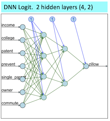
The DNN Logit was structured as shown below: 

I purposefully structured the above DNN to be fairly streamlined in order to facilitate convergence towards a solution.  Nevertheless, this structure was already too much for the DNN Soft Plus (where I had to prune down the hidden layers to (3, 2) in order to reach mediocre convergence (I also had to rise the error level threshold).  

When using the entire data set, the Goodness-of-fit measures indicate that the DNN Logit model is the clear winner. 

You can also observe the superiority of the DNN Logit visually on the scatter plots below. 

On the scatter plot matrix above, check out the one for the DNN Logit at the bottom right; and focus on how well it fits all the home prices > $1 million (look at rectangle defined by the dashed red and green lines).  As shown, the DNN Logit model fits those perfectly.  Meanwhile, the 3 other models struggle in fitting any of the data points > $1 million. 

However, when we move on to testing by creating new data (splitting the data between a train sample and a test sample), the DNN Logit performance is mediocre. 


 As shown above when using or creating new data and focusing on model prediction on such data, the DNN Logit predicting performance is rather poor.  It is actually weaker than a simple OLS regression using just 3 independent variables.  

Next, let's focus on what happened to the DNN Logit model by looking how it fit the "train 50%" data (using 50% of the data to train the model and fit zestimates) vs. how it predicted on the "test 50%" data (using the other half of the data to test the model's prediction). 

As shown in training, the DNN Logit model perfectly fit the home prices > $1 million.  At such stage, this model gives you the illusion that its DNN structure was able to leverage non linear relationships that OLS regressions can't.  

However, these non linear relationships uncovered during training were entirely spurious.  We can see that because in the testing the DNN Logit model was unable to predict other home prices > $1 million within the test 50% data.   

The two scatter plots above represent a perfect image of model overfitting.  


Thursday, May 5, 2022

Global Aging & Africa's Divergence

I recently completed an analysis focused on population aging, population age categories in % (age pyramids), and overall population growth.  It looks at various geographic units (countries, continents, regions, World) from 1950 to the Present (2019 & 2020).  And, it looks at projections out to 2100.  


I used data sourced from the UN Population Division.   


The main takeaway is that Africa is an outlier to the overall global aging; its population growth (historical & projected) is far faster than for other major regions. 


You can read the complete study at the following link: 

Global Aging at Slideshare 


... or a slightly shorter version at the following link:

Global Aging at Slidesfinder 


The above study consists of a Powerpoint with close to 60 slides.  It is very visual, and easy to digest.  But, as an intro to the whole thing, I will share a few highlights below by illustrating some of the key slides.  


First, let's disclose the three types of age pyramids.  Age pyramids are an aesthetic way of visualizing the population age profile of a country.  


A young population has a sharp looking pyramid with a large foundation (large youth base associated with high fertility) and a very sharp top (few elderly, short life expectancy). 

We can articulate an explanatory model that describes the process of global aging.  As women get more educated, they participate in the labor force.  And, fertility drops, life expectancy increases, population growth slows down, and population ages.

Within the full presentation, I share a ton of visual data that supports many of the variables' relationships defined in the model. 

This model explains how a population pyramid evolves from looking like a pyramid (young) to a urn (old), as shown below. 


The graph below compares the age pyramid of Nigeria, Brazil, and Japan in 1950 and in 2019. 


Back in 1950, the three countries' respective age pyramids looked nearly identical.  But, in 2019 they look radically different.  Nigeria's age pyramid has not changed since 1950.  It is still depicting a very young population.  Meanwhile, in 2019 Brazil's population pyramid looks very mature; and, Japan's looks very old. 


The population of Nigeria has grown from 37.9 million in 1950 to 206.1 million in 2020; and is projected to reach 793.9 million by 2100!


This historical and projected explosive population growth is true not only for Nigeria but for the whole of Africa.  Africa's population has grown from 0.23 billion in 1950 to 1.34 billion in 2020; and is projected to reach 4.47 billion in 2100!


Africa's continued explosive population growth is truly divergent when compared with any other large region. 


By comparison, see how Europe's population has already peaked by 2020, and is projected to decline out to 2100.  This is a picture of ongoing population aging.   


Population aging is even more pronounced for China.  Its population is expected to peak before 2040, and decline rapidly out to 2100. 


The table below discloses the population growth (historical and projected) for Africa and a few other major regions with population of more than 1 billion in 2020.


Notice how all four regions have a fairly similar population size in 2020.  However, by 2100 Africa's population is projected to be 3 to 4 times larger than the other regions!


And, this is how these regions share of the World population will change over the reviewed time periods. 


Next, let's compare Africa vs. the remainder of the World, excluding Africa.  


The World's population is projected to increase from 7.79 billion in 2020 to 10.88 billion in 2100.  And, the entire growth in the World's population is due to Africa.  The remainder of the World's population is projected to remain perfectly flat at around 6.4 billion.


Wednesday, February 2, 2022

Will we soon live to a 100?

 We are talking here of life expectancy at birth.   And, it represents the average (or probably the median) number of years one can expect to live when born in a given year.  This estimate is based on the current relevant mortality rate for each age-year.  

We already have centenarians now.  As a % of the population, the proportion of centenarians is likely to increase somewhat due to continuing progress in health care.  However, health care improvement may be partly countered by deterioration in health trends (rising diabetes, obesity rate, and declining fitness levels). 

To advance that in the near future we may reach a life expectancy of 100 is incredibly more challenging and unlikely than having a rising minority of the population reaching 100.  Here is why... for each person who dies at a more regular age of 70, you need 3 who make it to 110.  For each one who dies at birth, you need 10 who make it to 110. 

How about 90?  For each who dies at 70, you either need 2 who make it to a 100, or 1 who makes it to 110.  

You can see how the average life expectancy arithmetic is very forbidding. 

You can see my research on the subject at Slideshare.net and SlidesFinder.  

Live to a 100 at Slideshare    

Live to a 100 at SlidesFinder  

The above is a 35 slides presentation that is very visual and reads quickly.  Nevertheless, let me go over the main highlights. 

I looked at the life expectancy of just a few countries with very long life expectancy plus China and the US. 

                                                                                                                                                                           I observed an amazing amount of convergence between numerous countries that are geographically and genetically very distant.  These countries have also very different culture, lifestyle, and nutrition.  Yet, they all fare very well and have a converging life expectancy above 80 years old (several years higher than China and the US).  And, also several of those countries started from dramatically lower starting points.  This is especially true for Korea (South) that had a life expectancy much under 40 back in 1950.  And, now Korea's life expectancy is nearly as long as Japan, much above 80 years old


Next, I looked at the UN forecasts of such life expectancy out to 2099.  And, I found such forecasts incredibly optimistic. 

As shown, all countries' respective life expectancy keeps on rising in a linear fashion by 1.1 year per decade.  This seems highly unlikely.  The longer the life expectancy, the harder any further increase becomes.  The forecasts instead should probably be shaped as a logarithmic curve reflecting smaller improvements as life expectancy rises. 


I did attempt to generate forecasts for a few countries (Japan and the US) using linear-log regressions to follow the above shape, but without much success.  This was in part because the historical data from 1950 to 2020 is often pretty close to being linear ... just like the first half of the logarithmic curve above is also very close to being linear.  Maybe if I had modeled Korea, I may have had more success using a linear-log model.  But, there was no way I could have successfully used this model structure for all countries covered because the country-level historical data had often not yet entered its logarithmic faze (slower increase in life expectancy).  The UN forecasts entailed that if the history was linear, the forecasts would be linear too ... a rather questionable assumption.   

Also, as mentioned current deteriorations in health trends are not supportive of rising life expectancy...  especially life expectancy keeping on rising forever in a linear fashion.  I call this questionable forecasting method the danger of linear extrapolation. 

As shown below, the rate of diabetes is rising worldwide. 


Also, BMI is rising worldwide. 


This deterioration in health trends represents material headwinds against life expectancy keeping on rising into the distant future. 

The full presentation includes much more coverage on all the countries, more info on health trends; and it also looks at healthy life expectancy, a very interesting and maybe even more relevant subject than life expectancy.  Who wants to live to a 100 if it entails 30 years of disability.  Healthy life expectancy is what we really want.  At a high level, healthy life expectancy is typically a decade shorter than life expectancy.  For more detailed information go to the full presentations.    


Thursday, January 13, 2022

Will stock markets survive in 200 years? Some won't make it till 2050


Within a related study “The next 200 years and beyond” (see URLs below), 


The next 200 years at Slideshare


The next 200 years at SlidesFinder


... we disclosed that population and economic growth can’t possibly continue beyond just a few centuries.


Just considering what seems like a benign scenario: 


 Zero population growth with a 1% real GDP per capita growth … 


… would result in the World economy becoming 8 times greater within 288 years and 16 times greater within 360 years.  Thus, the mentioned scenario, as projected over the long term, is not feasible.  


This study contemplates how will stock markets survive in the absence of any demographic and economic growth.  The whole body of finance supporting stock markets (CAPM, Dividend Growth model, Internal Rate of Return, Net Present Value) evaporates in the absence of a growth input (market rate of return, dividend growth, etc.). 


And, current trends over the past few decades confirm the World is already heading in that direction.  In our minds, this raised existential considerations for stock markets. 


This study uncovered several stock markets that already experience current and prospective growth constraints.  And, the survival of several of those markets till 2050 appear questionable. 


Place yourself in the shoes of college graduates entering the labor force and investing in their 401K for retirement.  The common wisdom is to invest the majority of such funds in the stock market to reap maximum growth over the long term.  Such a well established strategy, would most probably not work out for the majority of the 11 markets reviewed.  And, it could be devastating if the college grad lives in Greece, Italy, or Ukraine. 


Similar considerations, within the same mentioned countries, would affect any institutional investors focused on the long term such as pension funds, endowment funds, insurers, retail index fund investors, etc.


In the US, we may be spared these bearish considerations, but for how long?  A century or two from now, we in the US may be affected by the same considerations.  


You can see the complete study at the following link below: 

 Stock market in 200 years at Slideshare


Thursday, November 18, 2021

Is Japan indicative of the future of the US?

Japan leads the US towards a path associated with:
a) a decreasing fertility rate much below replacement rate;
b) an aging society;
c) a declining population growth;
d) a slowing economy; and
e) an increasingly leveraged Public finance position (large Budget Deficits, very high Public/Debt ratio).

However, the two countries are likely to continue diverging materially on several counts:


a) The US population growth is already declining.  But, it is likely to remain positive and much above Japan.  That is because the US benefits from a robust net migration of close to + 1.5% of the population per year vs. only 0.5% for Japan; 


b) Health status and healthcare costs metrics will likely continue to show Japan with far better health outcome associated with far lower health care costs.  This is in good part because of the inputs.  Japanese are far healthier than Americans.  And, these divergences appear likely to continue; 


c) Japan is likely to continue outperforming the US on primary school indicators; 


d) The US is likely to continue outperforming Japan on university level indicators and the generation of science and engineering degrees and papers. 


I have conducted a detailed analysis of all of the above that I share at: 

Study at Slideshare.net

Study at SlidesFinder  

I share these two different platform access options, as I don't know which one is easiest to access.

Below I am sharing just a few of the key slides of this analysis.
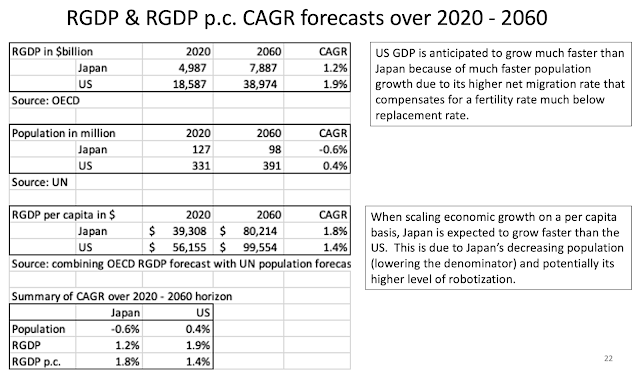
The slide below discloses that over the next 40 years, the US population and economy is anticipated to grow much faster than Japan, mainly due to the US higher net migration.  However, Japan's Real GDP per capita is expected to grow faster than the US.


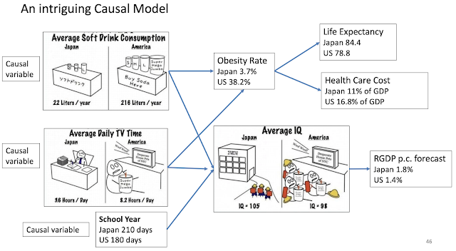
This next slide is an intriguing causal model.  It discloses that Americans drink a lot more soft drinks, watch a lot more TV, and have a far shorter school year than Japanese.  These three indicators may have causal implications on several health metrics: obesity rate, life expectancy, and health care cost.  They may also have implication in overall population IQ and prospective RGP p.c. forecast.

Below, I am just sharing a few references regarding the respective countries' IQ score. 


While the trends reviewed so far favor Japan, the next set of trends related to upper level education reflect a marked competitive advantage for the US. 

The US dominates the ranks of top universities. 


The US also produces a competitive number of Doctorate degrees in science and engineering. 


The US also publishes a competitive number of papers and articles in science and engineering. 


Saturday, October 30, 2021

The Next 200 Years and Beyond

 Within this study at the link below:

The Next 200 Years,

I envision what the World may look like over the next few centuries from a demographic and economic standpoint (looking both at respective growth and levels). 

If we look at a history of the World from such a perspective, our history is extremely simple.  You need to remember one single data: the onset of the Industrial Revolution at the beginning of the 1800s.


 Over the past 200 years, the World population has increased by 8 times, and the GDP per capita has increased close to 15 times.  Going forward over the next couple of centuries, these respective growth rates will certainly not replicate themselves. 

Looking out several centuries, our respective growth (in both economy and population) are likely to follow the pattern depicted in the graph below. 

From left to right, the graph starts with an S Curve beginning with the Industrial Revolution at the first inflection point of that S Curve.  Next, comes the extraordinary exponential growth over the next 200 years reaching out to the Present.  The latter is on the second inflection of that S Curve associated with a flattening of the mentioned growth.  Going out further to the right, we observe that growth has flattened.  And, it is soon sitting at the first inflection point near the top of a second and smaller inverted S Curve.  Following that curve, some of the growth rates mentioned may even turn negative.  World population is likely to decline and eventually stabilize past the second inflection of the inverted S Curve at some Equilibrium level.  Beyond that point, the respective growth rates (especially demographic growth) are likely to oscillate up and down around the Equilibrium level.  Mind you this process is likely to work itself out over several centuries.  

If you look at the present situation, there is already an abundance of evidence that the growth rates are flattening, if not even declining.  That is especially true for demographic growth.  The fertility rates in the vast majority of the developed World including China is already much below replacement rate (at around 2 children per woman).  Even within the least developed countries (LDCs) where fertility is relatively really high, it has plummeted within the past 60 years or so.  Within the next 100 years, even the LDCs fertility rates may be much below replacement levels.  Similarly, economic growth can't go on forever either.  And, economic growth in much of the developed World including China has slowed down over the past 60 years. 

This begs an interesting question.  What will the stock market be like in 500 years from now.  Over the long term the stock market growth is equal to: demographic + economic growth (per capita) + inflation + speculation.  But, in 500 years from now when we will likely have found an Equilibrium, the only factor left boosting the market will be speculation.  In essence, the stock market will become a Zero-sum game.  We will be betting on specific companies' stocks just like we are betting on a specific horse or basketball team within the sports gambling domain.  Such a stock market could remain viable.  After all, the gigantic derivatives market is very much a Zero-sum game too.   
 

Compact Letter Display (CLD) to improve transparency of multiple hypothesis testing

Multiple hypothesis testing is most commonly undertaken using ANOVA.  But, ANOVA is an incomplete test because it only tells you ...