Tuesday, May 24, 2022

Overfitting with Deep Neural Network (DNN) models

 I developed a set of models to explain, estimate, and predict home prices.  My second modeling objective was to benchmark the accuracy in testing (prediction) of simple OLS regression models vs. more complex DNN model structures.  

I won't spend any time describing in much detail the data, the explanatory variables, etc.  For that you can look at the complete study at the following links.  The study is pretty short (about 20 slides). 

Housing Price models at Slideshare

Housing Price models at Slidesfinder 

Just to cover the basics, the dependent variable is home prices in April 2022 defined as the median county zestimate from Zillow, that I just call zillow within the models.  The models use 7 explanatory variables that capture income, education, innovation, commute time, etc.  All variables are standardized.  But, final output is translated back into nominal dollars using a scale of $000.

The models use data for over 2,500 counties. 

I developed four models:

1. A streamlined OLS regression (OLS Short) that uses only three explanatory variables.  It worked as well as any of the other models in testing/predicting; 

2. An OLS regression with all 7 explanatory variables (OLS Long).  It tested & predicted with about the same level of accuracy as OLS Short.  But, as specified it was far more explanatory (due to using 7 explanatory variables, instead of just 3); 

3. A DNN model using the smooth rectified linear unit activation function.  I called it DNN Soft Plus.  This model structure had real challenge converging towards a solution.  Its testing/predicting performance was not any better than the OLS regressions; 

4.  A DNN model using the Sigmoid activation function (DNN Logit).  And, this model will be the main focus of our analysis regarding overfitting with DNNs.   

The DNN Logit was structured as shown below: 

I purposefully structured the above DNN to be fairly streamlined in order to facilitate convergence towards a solution.  Nevertheless, this structure was already too much for the DNN Soft Plus (where I had to prune down the hidden layers to (3, 2) in order to reach mediocre convergence (I also had to rise the error level threshold).  

When using the entire data set, the Goodness-of-fit measures indicate that the DNN Logit model is the clear winner. 

You can also observe the superiority of the DNN Logit visually on the scatter plots below. 

On the scatter plot matrix above, check out the one for the DNN Logit at the bottom right; and focus on how well it fits all the home prices > $1 million (look at rectangle defined by the dashed red and green lines).  As shown, the DNN Logit model fits those perfectly.  Meanwhile, the 3 other models struggle in fitting any of the data points > $1 million. 

However, when we move on to testing by creating new data (splitting the data between a train sample and a test sample), the DNN Logit performance is mediocre. 


 As shown above when using or creating new data and focusing on model prediction on such data, the DNN Logit predicting performance is rather poor.  It is actually weaker than a simple OLS regression using just 3 independent variables.  

Next, let's focus on what happened to the DNN Logit model by looking how it fit the "train 50%" data (using 50% of the data to train the model and fit zestimates) vs. how it predicted on the "test 50%" data (using the other half of the data to test the model's prediction). 

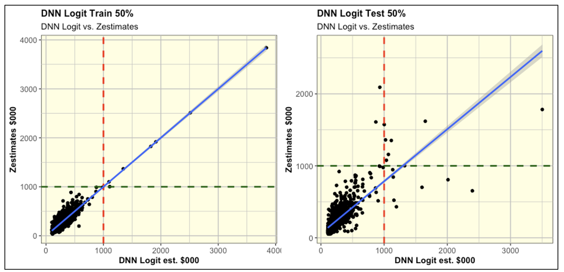
As shown in training, the DNN Logit model perfectly fit the home prices > $1 million.  At such stage, this model gives you the illusion that its DNN structure was able to leverage non linear relationships that OLS regressions can't.  

However, these non linear relationships uncovered during training were entirely spurious.  We can see that because in the testing the DNN Logit model was unable to predict other home prices > $1 million within the test 50% data.   

The two scatter plots above represent a perfect image of model overfitting.  


Thursday, May 12, 2022

Is the Market Rigged (Part II)?

 This is a follow up to my earlier blog post on the subject a few days ago.  To remind ourselves, our starting point was the following chart from the Bespoke Investment Group that indicated that the entire accrued value of the S&P 500 since 1992 was captured by After Hours traders (who bought the S&P 500 after the Close the previous day and sold it at the Open on the following day), and that the "during regular hours traders" (who bought the S&P 500 at the Open and sold it at the Close of the market on a daily basis), did not capture any of the upward movement in the S&P 500 since 1992. 


At the time, I was skeptical  that the After Hours traders would reap 100% or more of the gains in the S&P 500.  And, I replicated this graph using data from Yahoo Finance.  And, I uncovered that the Bespoke Investment Group (BIG)  simply confused one variable for another.  And, after making the appropriate correction, the World still made sense.  And, contrary to what BIG disclosed, the vast majority of the gains were actually captured to the traders during market hours as one would expect as shown on my chart below. 


Readers of the first blog post on the subject a few days ago invited me to give the data a second and more detailed look at the data.  When I did that, I uncovered that there is a divergent period from September 2016 to the present, when the majority of the gains actually do flow to the After Hours traders.  And, the chart below reflecting this visual data looks very similar to the original BIG chart (but using a truncated time period). 


In the chart above, over the reviewed period, even after using accurate data the vast majority of the gains in the S&P 500 do accrue to the After Hours traders.  I find that rather dismaying.  And, after doing a bit of research based on hypotheses generated by readers, I could find an explanation.  There are a lot of breaking news during the After Hours period.  Companies are allowed to release quarterly earnings after the market Close and before the market Open.  Similarly, the majority of economic indicators releases are disclosed by the Government before the market Open.  Given that, it makes much sense that the After Hours traders would reap the gains.  

Now, is the market rigged?  I find this question really uncomfortable because I find it rather challenging to answer this question in the negative.  The timing of breaking news disclosure favors the large institutional investors over the retail investors that trade mainly during regular trading hours.

However, I have no explanation why this phenomenon (advantage of institutional investors trading After Hours) kicked in only since September 2016.  

Yet, I am concerned that once this advantage has been captured by institutional investors, it will propagate going forward forever. 

On the other hand, I am still comforted that a simple Buy & Hold strategy still performs a lot better than the daily After Hours strategy, as shown on the chart below. 


 The simple Buy & Hold strategy holds several "efficient" advantages over the After Hours trading, including: 

1) Operating efficiency.  Buy & Hold foregoes having to make 506 trades a year (253 trading days times 2 trades per day); 

2) Buy & Hold value accretion is not impaired by bid-ask spreads.  The latter materially affects the After Hours traders' value accretion, that is not shown on this graph (absence of data); and 

3) Tax efficiency.  The After Hours traders gains are 100% taxable as ordinary income.  The Buy & Hold traders have unrealized capital gains that are not taxable.  And, they will be taxable only when realized at much lower capital gains tax rates.  

More often than not, the Buy & Hold strategy over a long period of time will perform better than After Hours trading; that is because Buy & Hold gains = After Trading Hours gains + Regular Hours gains + compounding effect.  For instance, since September of 2016, when After Trading Hours performed well, it captured 80% of the gains of the Buy & Hold strategy.  During Regular Hours trading captured 10%.  And, the compounding effect captured the remaining 10%.  

Monday, May 9, 2022

Is the Market rigged?

 A friend of mine recently shared this arresting chart.


The above chart suggests that since the beginning of 1993, some large institutional investors extracted all the gains out of the S&P 500 by simply buying it at the Close of the previous day and selling it at the Open of the following day.  Meanwhile, many retail investors (day-traders types) who would simply buy the S&P 500 at the Open and sell it at the Close during regular trading hours would have reaped no gain whatsoever going back to 1992!  

The chart above was created by the Bespoke Investment Group.  You can review their website at the link below.

Bespoke Investment Group  

For a better understanding of After Hours Trading, please refer to the following link. 

After Hours Trading explanation

The above chart left me baffled.  So, I extracted the relevant data from Yahoo Finance.  And, I replicated this chart.  And, all of a sudden the World still made sense.  And, the Market is not rigged (at least on this one count).  


As you can see on my chart above, the gains in the S&P 500 accrue to the ones who simply bought it at the Open and sold it at the Close during the regular trading hours.  Meanwhile, the ones who would have traded after hours, overall did not reap any gain whatsoever.  My chart looks very much like the one from Bespoke, except that in my chart the gains are associated with the regular trading hours.  I gather, Bespoke simply confused the time series for After Hours Trading vs. Regular Hours Trading.  

Next, I just added an extra time series to see how those strategies would compare vs. simply a Buy & Hold strategy.  

As shown above, you can see that from beginning to end point, the Buy & Hold strategy is way ahead. 

However, most of that advantage occurred in the past couple of years since the beginning of 2020 (blue line spikes upward much above the red line).  During this period, the After Hours traders made some marginal gains (the Market on the next day at the Open was at times marginally higher than the Close of the previous day).  And, those small gains compounded on a larger accrued value for the Buy & Hold strategy, allowed it to zoom passed the regular trading hour strategy. 

The reverse was true during a long period from the end of 2006 to end of 2014, when the Buy & Hold strategy was hindered by the small losses in the S&P 500 between the Close of the previous day and the Open of the following day.  During that period, you can see the red line (regular trading) steadily above the blue line (Buy & Hold).  Afterwards, the two lines start to converge. 

From the end of 1992 till the end of 2006, there was virtually no difference between Buy & Hold and Regular Trading hours (the blue and red lines overlap, so you just see the blue one).  This entails that throughout that period, the S&P 500 opened the next day at the exact same value as the Close on the previous day. 

Once you convey the S&P 500 data accurately, there is nothing that suggests that institutional investors who trade after hours extract any rent-profits from the Market.  

Although this was not the main topic of this post, you have to note the superior efficiency of the Buy & Hold strategy on several counts.  And, the "efficiency" has several dimensions.  

First, from an operational standpoint, the Buy & Hold strategy allows you to avoid 506 trades per year (253 trading days x 2 trades per day).  

Second, it is a lot more tax efficient.  All the accrued value represents not taxed unrealized capital gains.  Meanwhile, all gains under the other two strategies would be taxed as short-term gains at ordinary income tax rates.  

Thursday, May 5, 2022

Global Aging & Africa's Divergence

I recently completed an analysis focused on population aging, population age categories in % (age pyramids), and overall population growth.  It looks at various geographic units (countries, continents, regions, World) from 1950 to the Present (2019 & 2020).  And, it looks at projections out to 2100.  


I used data sourced from the UN Population Division.   


The main takeaway is that Africa is an outlier to the overall global aging; its population growth (historical & projected) is far faster than for other major regions. 


You can read the complete study at the following link: 

Global Aging at Slideshare 


... or a slightly shorter version at the following link:

Global Aging at Slidesfinder 


The above study consists of a Powerpoint with close to 60 slides.  It is very visual, and easy to digest.  But, as an intro to the whole thing, I will share a few highlights below by illustrating some of the key slides.  


First, let's disclose the three types of age pyramids.  Age pyramids are an aesthetic way of visualizing the population age profile of a country.  


A young population has a sharp looking pyramid with a large foundation (large youth base associated with high fertility) and a very sharp top (few elderly, short life expectancy). 

We can articulate an explanatory model that describes the process of global aging.  As women get more educated, they participate in the labor force.  And, fertility drops, life expectancy increases, population growth slows down, and population ages.

Within the full presentation, I share a ton of visual data that supports many of the variables' relationships defined in the model. 

This model explains how a population pyramid evolves from looking like a pyramid (young) to a urn (old), as shown below. 


The graph below compares the age pyramid of Nigeria, Brazil, and Japan in 1950 and in 2019. 


Back in 1950, the three countries' respective age pyramids looked nearly identical.  But, in 2019 they look radically different.  Nigeria's age pyramid has not changed since 1950.  It is still depicting a very young population.  Meanwhile, in 2019 Brazil's population pyramid looks very mature; and, Japan's looks very old. 


The population of Nigeria has grown from 37.9 million in 1950 to 206.1 million in 2020; and is projected to reach 793.9 million by 2100!


This historical and projected explosive population growth is true not only for Nigeria but for the whole of Africa.  Africa's population has grown from 0.23 billion in 1950 to 1.34 billion in 2020; and is projected to reach 4.47 billion in 2100!


Africa's continued explosive population growth is truly divergent when compared with any other large region. 


By comparison, see how Europe's population has already peaked by 2020, and is projected to decline out to 2100.  This is a picture of ongoing population aging.   


Population aging is even more pronounced for China.  Its population is expected to peak before 2040, and decline rapidly out to 2100. 


The table below discloses the population growth (historical and projected) for Africa and a few other major regions with population of more than 1 billion in 2020.


Notice how all four regions have a fairly similar population size in 2020.  However, by 2100 Africa's population is projected to be 3 to 4 times larger than the other regions!


And, this is how these regions share of the World population will change over the reviewed time periods. 


Next, let's compare Africa vs. the remainder of the World, excluding Africa.  


The World's population is projected to increase from 7.79 billion in 2020 to 10.88 billion in 2100.  And, the entire growth in the World's population is due to Africa.  The remainder of the World's population is projected to remain perfectly flat at around 6.4 billion.


Compact Letter Display (CLD) to improve transparency of multiple hypothesis testing

Multiple hypothesis testing is most commonly undertaken using ANOVA.  But, ANOVA is an incomplete test because it only tells you ...