Showing posts with label markets. Show all posts

Tuesday, June 21, 2022

Are we already in a recession?

2022 Q1 GDP growth was already negative.  And, 2022 Q2 may very well be [negative] when the released data comes out. 


The majority of the financial media believes we are already in a recession because of the stubbornly high inflation (due to supply chain bottlenecks) and the Federal Reserve aggressive monetary policy to fight inflation.  The policy includes a rapid rise in short-term rates, and a reversing of the Quantitative Easing bond purchase program (reducing the Fed’s balance sheet and taking liquidity & credit out of the financial system).  The Bearish stock market also suggests we are currently in a recession. 


On the other hand, Government authorities including the President, the Secretary of the Treasury (Janet Yellen), and the Federal Reserve all believe that the US economy can achieve a “soft landing” with a declining inflation rate, while maintaining positive economic growth.  


The linked presentations include two explanatory models to attempt to predict recessions.  


Recessions at Slideshare.net 

Recessions at SlidesFinder  


The first one is a logistic regression.  The second one is a deep neural network (DNN).  Both use the same set of independent variables: the velocity of money, inflation, the yield curve, and the stock market.  


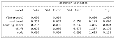
A copy of one of the slides describes the Logistic Regression model below.


A foundational equality: Price x Quantity = Money x Velocity of money


The logistic regression to predict regression includes Price (cpi) and Velocity (velo).  As the CPI goes up, the probability of a recession increases and vice versa.  As the velocity of money goes up the probability of a recession decreases and vice versa. 


This model also includes the yield curve, a well established variable to predict recession.  Notice that this variable is not quite statistically significant (p-value 0.14).  But, the sign of the coefficient is correct.  It does inform and improve the model.  And, is well supported by economic theory.  When the yield curve widens the probability of a recession goes down and vice versa.

The model includes the stock market (S&P 500) that is by nature forward looking in terms of economic outlook.  This makes it a most relevant variable to include in a regression model to predict recessions.  When the stock market goes up, the probability of a recession goes down and vice versa. 

The deep neural network (DNN) model is described below.

 The DNN model uses the same explanatory variable inputs.  

The DNN model has two hidden layers with 3 neurons in the first one, and 2 neurons in the second one. 

Number of neurons is nearly predetermined as hidden layers must have fewer neurons than the input layer and more neurons than the output layer. 


The activation function is Sigmoid, which is the same as a Logistic Regression.  And, the output function is also Sigmoid.  This makes this DNN consistent with the Logistic Regression model.  


I noticed that when using the entire data (from 1960 to the present using quarterly data), ROC curves and Kolmogorov - Smirnov plots did not differentiate between the two models.  I am just showing the KS plots below.  The two plots are very similar, not allowing you to clearly rank the models. 


The next set of plots more clearly differentiate between the two models.  


On the plots above, the recessionary quarters are shown in green, and the others are shown in red.  You can see that the DNN generates nearly ideal probabilities that are very close to 1 during a recession, and very close to Zero otherwise.  The Logistic Regression model generates a much more continuous set of probabilities within the 0 to 1 boundaries.  Notice that both models do make a few mistakes with green dots (indicating recessions), when they should be red.  

The graph above displays how much more certain the DNN model is.  


All of the above visual data was generated using the entire data set.  Next, we will briefly explore how the models fared when predicting several recessionary periods treated as Hold Out or out-of-sample if you will. 


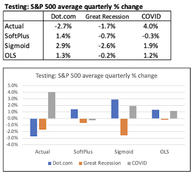
Let's start with the Great Recession. 


As shown above, during the Great Recession period, the Logistic Regression was a lot better at capturing the actual recessionary quarters.  It captured 4 out of 5 of them vs. only 2 out of 5 for the DNN. 

Next, let's look at the COVID Recession period. 


The above shows a rather rare occurrence in econometrics modeling, a perfect prediction.  Indeed, both models with much certainty predicted all 6 quarters of this COVID Recession period correctly.  And, as a reminder, these 6 quarters were indeed treated out-of-sample. 

Next, we will use a frequentist Bayesian representation of both models when combining all the recession periods we tested (on an out-of-sample basis).


We can consider that recession is like a disease.  And, given a disease prevalence, a given test sensitivity and specificity, we can map out the actual accuracy of a positive test or a negative test.  Below we are doing the exact same thing treating recession as a disease.  


Here is the mentioned representation for the Logistic Regression.


As shown above, during the cumulative combined periods there were 13 recessionary quarters out of a total of 30 quarters.  And, the Logistic Regression model correctly predicted 10 out of the 13 recessionary quarters. 


 And, now the same representation for the DNN.


   A table of these accuracy measures is shown below.


When you use the entire data set, the DNN is marginally more accurate.  When you focus on the recessionary periods on an out-of-sample basis, the two models are very much tied.


So, can these models predict the current prospective recession? 


No, they can’t.  That is for a couple of reasons: 


First, both models have already missed out 2022 Q1 as a recessionary quarter.  Even using the historical data (not true testing), the Logistic Regression model assigned a probability of a recession of only 6% for 2022 Q1; and the DNN assigned a probability of 0%.  Remember, the DNN is always far more deterministic in its probability assessments.  So, when it is wrong, it is far more off than the Logistic Regression model. 


Second, for the models to be able to forecast accurately going forward, you would need to have a crystal ball to accurately forecast the 4 independent variables.  And, that is a general shortcoming of all econometrics models. 


Thursday, May 12, 2022

Is the Market Rigged (Part II)?

 This is a follow up to my earlier blog post on the subject a few days ago.  To remind ourselves, our starting point was the following chart from the Bespoke Investment Group that indicated that the entire accrued value of the S&P 500 since 1992 was captured by After Hours traders (who bought the S&P 500 after the Close the previous day and sold it at the Open on the following day), and that the "during regular hours traders" (who bought the S&P 500 at the Open and sold it at the Close of the market on a daily basis), did not capture any of the upward movement in the S&P 500 since 1992. 


At the time, I was skeptical  that the After Hours traders would reap 100% or more of the gains in the S&P 500.  And, I replicated this graph using data from Yahoo Finance.  And, I uncovered that the Bespoke Investment Group (BIG)  simply confused one variable for another.  And, after making the appropriate correction, the World still made sense.  And, contrary to what BIG disclosed, the vast majority of the gains were actually captured to the traders during market hours as one would expect as shown on my chart below. 


Readers of the first blog post on the subject a few days ago invited me to give the data a second and more detailed look at the data.  When I did that, I uncovered that there is a divergent period from September 2016 to the present, when the majority of the gains actually do flow to the After Hours traders.  And, the chart below reflecting this visual data looks very similar to the original BIG chart (but using a truncated time period). 


In the chart above, over the reviewed period, even after using accurate data the vast majority of the gains in the S&P 500 do accrue to the After Hours traders.  I find that rather dismaying.  And, after doing a bit of research based on hypotheses generated by readers, I could find an explanation.  There are a lot of breaking news during the After Hours period.  Companies are allowed to release quarterly earnings after the market Close and before the market Open.  Similarly, the majority of economic indicators releases are disclosed by the Government before the market Open.  Given that, it makes much sense that the After Hours traders would reap the gains.  

Now, is the market rigged?  I find this question really uncomfortable because I find it rather challenging to answer this question in the negative.  The timing of breaking news disclosure favors the large institutional investors over the retail investors that trade mainly during regular trading hours.

However, I have no explanation why this phenomenon (advantage of institutional investors trading After Hours) kicked in only since September 2016.  

Yet, I am concerned that once this advantage has been captured by institutional investors, it will propagate going forward forever. 

On the other hand, I am still comforted that a simple Buy & Hold strategy still performs a lot better than the daily After Hours strategy, as shown on the chart below. 


 The simple Buy & Hold strategy holds several "efficient" advantages over the After Hours trading, including: 

1) Operating efficiency.  Buy & Hold foregoes having to make 506 trades a year (253 trading days times 2 trades per day); 

2) Buy & Hold value accretion is not impaired by bid-ask spreads.  The latter materially affects the After Hours traders' value accretion, that is not shown on this graph (absence of data); and 

3) Tax efficiency.  The After Hours traders gains are 100% taxable as ordinary income.  The Buy & Hold traders have unrealized capital gains that are not taxable.  And, they will be taxable only when realized at much lower capital gains tax rates.  

More often than not, the Buy & Hold strategy over a long period of time will perform better than After Hours trading; that is because Buy & Hold gains = After Trading Hours gains + Regular Hours gains + compounding effect.  For instance, since September of 2016, when After Trading Hours performed well, it captured 80% of the gains of the Buy & Hold strategy.  During Regular Hours trading captured 10%.  And, the compounding effect captured the remaining 10%.  

Monday, May 9, 2022

Is the Market rigged?

 A friend of mine recently shared this arresting chart.


The above chart suggests that since the beginning of 1993, some large institutional investors extracted all the gains out of the S&P 500 by simply buying it at the Close of the previous day and selling it at the Open of the following day.  Meanwhile, many retail investors (day-traders types) who would simply buy the S&P 500 at the Open and sell it at the Close during regular trading hours would have reaped no gain whatsoever going back to 1992!  

The chart above was created by the Bespoke Investment Group.  You can review their website at the link below.

Bespoke Investment Group  

For a better understanding of After Hours Trading, please refer to the following link. 

After Hours Trading explanation

The above chart left me baffled.  So, I extracted the relevant data from Yahoo Finance.  And, I replicated this chart.  And, all of a sudden the World still made sense.  And, the Market is not rigged (at least on this one count).  


As you can see on my chart above, the gains in the S&P 500 accrue to the ones who simply bought it at the Open and sold it at the Close during the regular trading hours.  Meanwhile, the ones who would have traded after hours, overall did not reap any gain whatsoever.  My chart looks very much like the one from Bespoke, except that in my chart the gains are associated with the regular trading hours.  I gather, Bespoke simply confused the time series for After Hours Trading vs. Regular Hours Trading.  

Next, I just added an extra time series to see how those strategies would compare vs. simply a Buy & Hold strategy.  

As shown above, you can see that from beginning to end point, the Buy & Hold strategy is way ahead. 

However, most of that advantage occurred in the past couple of years since the beginning of 2020 (blue line spikes upward much above the red line).  During this period, the After Hours traders made some marginal gains (the Market on the next day at the Open was at times marginally higher than the Close of the previous day).  And, those small gains compounded on a larger accrued value for the Buy & Hold strategy, allowed it to zoom passed the regular trading hour strategy. 

The reverse was true during a long period from the end of 2006 to end of 2014, when the Buy & Hold strategy was hindered by the small losses in the S&P 500 between the Close of the previous day and the Open of the following day.  During that period, you can see the red line (regular trading) steadily above the blue line (Buy & Hold).  Afterwards, the two lines start to converge. 

From the end of 1992 till the end of 2006, there was virtually no difference between Buy & Hold and Regular Trading hours (the blue and red lines overlap, so you just see the blue one).  This entails that throughout that period, the S&P 500 opened the next day at the exact same value as the Close on the previous day. 

Once you convey the S&P 500 data accurately, there is nothing that suggests that institutional investors who trade after hours extract any rent-profits from the Market.  

Although this was not the main topic of this post, you have to note the superior efficiency of the Buy & Hold strategy on several counts.  And, the "efficiency" has several dimensions.  

First, from an operational standpoint, the Buy & Hold strategy allows you to avoid 506 trades per year (253 trading days x 2 trades per day).  

Second, it is a lot more tax efficient.  All the accrued value represents not taxed unrealized capital gains.  Meanwhile, all gains under the other two strategies would be taxed as short-term gains at ordinary income tax rates.  

Monday, March 21, 2022

Can you Deep Learn the Stock Market?

You can read the complete study at the following links:  


DNN Stock Market Study at SlidesFinder 

DNN Stock Market Study at Slideshare 


Objectives:

We will test whether: 


a) Sequential Deep Neural Networks (DNNs) can predict the stock market better than OLS regression;

b) DNNs using smooth Rectified Linear Unit activation functions perform better than the ones using Sigmoid (Logit) activation functions. 
 

Data:

Quarterly data from 1959 Q2 to 2021 Q3.  All variables are fully detrended as quarterly % change or first differenced in % (for interest rate variables).  Models are using standardized variables.  Predictions are converted back into quarterly % change.  


Data sources are from FREDS for the economic variables, and the Federal Reserve H.15 for interest rates.


Software used for DNNs.

R neuralnet package.  Inserted a customized function to use a smooth ReLu (SoftPlus) activation function.   


The variables within the underlying OLS Regression models are shown within the table below: 


Consumer Sentiment is by far the most predominant variable.  This is supported by the behavioral finance (Richard Thaler) literature.  


Housing Start is supported by the research of Edward E. Leamer advancing that the housing sector is a leading indicator of overall economic activity, which in turn impacts the stock market. 


Next, the Yield Curve (5 Year Treasury minus FF), and economic activity (RGDP growth) are well established exogenous variables that influence the stock market.  Both are not quite statistically significant.  And, their influence is much smaller than for the first two variables.  Nevertheless, they add explanatory logic to our OLS regression fitting the S&P 500. 


The above were the best variables we could select out of a wide pool of variables including numerous other macroeconomic variables (CPI, PPI, Unemployment rate, etc.) interest rates, interest rate spreads, fiscal policy, and monetary policy (including QE) variables. 


Next, let's quickly discuss activation functions of hidden layers within sequential Deep Neural Networks (DNN) model.  Until 2017 or so, the preferred activation function was essentially a Logit regression called Sigmoid function.


There is nothing wrong with the Sigmoid function per se.  The problem occurs when you take the first derivative of this function.  And, it compresses the range of values by 50% (from 0 to 1, to 0 to 0.5 for the first iteration).  In iterative DNN models, the output of one hidden layer becomes the input for the sequential layer.  And, this 50% compression from one layer to the next can generate values that converge close to zero.  This problem is called the “vanishing gradient descent.”  


Over the past few years, the Rectified Linear function, called ReLu, has become the most prevalent activation function for hidden layers.  We will advance that the smooth ReLu, also called SoftPlus is actually much superior to ReLu. 


SoftPlus appears superior to ReLu because it captures the weights of many more neurons’ features, as it does not zero out any such features with input values < 0.  Also, it generates a continuous set of derivatives values ranging from 0 to 1.  Instead, ReLu derivatives values are limited to a binomial outcome (0, 1). 


Here is a picture of our DNN structure. 


One input layer with 4 independent variables: Consumer Sentiment, Housing Start, Yield Curve, and RGDP. 
 
Two hidden layers.  The first one with 3 nodes, and the second one with 2 nodes.  Activation function for the two hidden layers are SoftPlus for the 1st DNN model, and Sigmoid for the second one.
 
One output variable, with one node, the dependent variable, the S&P 500 quarterly % change.  The output layer has a linear activation function. 
 
The DNN loss function is minimizing the sum of the square errors (SSE).  Same as for OLS.  
 

The balance of the DNN structure is appropriate.  It is recommended that the hidden layers have fewer 

nodes than the input one; and, that they have more nodes than the output layer.  Given that, the choice of 

nodes at each layer is just about predetermined.  More extensive DNNs would not have worked anyway.   

This is because the DNNs, as structured, already had trouble converging towards a solution given an 

acceptable error threshold. 


As expected the DNN models have much better fit with the complete historical data than the OLS 

Regression. 


As seen above, despite the mentioned limitation of the Sigmoid function, the two DNN models (SoftPlus 

vs. Sigmoid) relative performances are indistinguishable.  And, they are both better than OLS Regression.


But, fitting historical data and predicting or forecasting on an out-of-sample or Hold Out test basis are two 

completely different hurdles.  Fitting historical data is a lot easier than forecasting.


We will use three different Test periods as shown in the table below:


Each testing period is 12 quarters long.  And, it is a true Hold Out or out-of-sample test.  The training data 

consists of all the earlier data from 1959 Q2 up to the onset of the Hold Out period.  Thus, for the 

Dot.com period, the training data runs from 1959 Q2 to 2000 Q1.

 
The quarters highlighted in orange denote recessions.  We call the three periods, Dot.com, Great 
Recession, and COVID periods as each respective period covers the mentioned events.
 
To visualize the models' respective prediction performance, we will use "skylines."  The column graph 
below looks like a set of skylines with vertical buildings for positive values and reflection in water for 
negative values.  Within the complete linked study, we show several other ways to convey the forecasting 
performance that you may prefer.  
 
 
As shown above, all the models predictions are really pretty dismal.  None of the models predicted the 
protracted 3-year Bear market associated with the Dot.com bubble.  At the margin, the OLS model
actually performed a bit better than the DNN models.  

Now, let's look at the Great Recession period.  In this situation, the models did better.  However, their 
overall predicting performance was nothing to write home about.  All models completely missed the 
severe market correction in the third year of the Great Recession period.  And, again the DNN models did 
not perform any better than the OLS Regression.

 
When focusing on the COVID period, the ongoing mediocrity (at best) of the models' prediction 
performance is readily apparent.  All models completely missed the robust Bull market in the third year of 
the COVID period (as defined).  Again, the DNN models did not fare any better than the simpler OLS 
Regression.  
 
If we look at average predictions for all three models for all three testing periods, we can get a quick 
snapshot of the competitiveness of the models. 
 

Without getting bogged down into attempting to fine tune model rankings between these three models, we can still derive two takeaways.  

The first one is that the Sigmoid issue with the "vanishing gradient descent" did not materialize.  As shown, the Sigmoid DNN model actually was associated with greater volatility in average S&P 500 quarterly % change than for the SoftPlus DNN model.   

The second one is that the DNN models did not provide any prediction incremental benefits over the simpler OLS Regression.  

So, why did all the models, regardless of their sophistication, pretty much fail in their respective predictions? 

It is for a very simple reason.  All the relationships between the Xs and Y variables are very unstable.  The table below shows the correlations between such variables during the Training and Testing periods.  As shown, many of the correlations are very different between the two (Training and Testing).  At times, those correlations even flip signs (check out the correlations with the Yield Curve (t5_ff)).  


The models' predictions failing is especially humbling when you consider that the mentioned 3-year Hold Out tests still presumed you had perfect information over the next 3 years regarding the four X variables.  As we know, this is not a realistic assumption.  


Compact Letter Display (CLD) to improve transparency of multiple hypothesis testing

Multiple hypothesis testing is most commonly undertaken using ANOVA.  But, ANOVA is an incomplete test because it only tells you ...