Showing posts with label economics. Show all posts

Thursday, March 3, 2022

Can Treasury Inflation Protected Securities (TIPS) predict Inflation?

 Treasury Yield - TIPS Yield = Inflation Expectation

The above basic equation allows to derive long term Inflation Expectation from the bond market.  By looking at the spread between Treasuries and TIPS of identical maturities, we can derive inflation expectation over a 5 year, 7 year, and 10 year horizon. 

The TIPS data is unfortunately very limited and starts only in 2003.  However, given that we deal with monthly observations the data is still associated with numerous data points. 

So back in 2003, we could derive annualized 5 year, 7 year, and 10 year inflation expectations by looking at the spread between the matching Treasuries and TIPS. 

In 2003, we derived annualized 5 year expectation over the 2003- 2008 period.  And, we compare this inflation expectation with the actual annualized 5 year inflation rate over this same 2003 - 2008 period observed in 2008.  So, when we graph this data, the first observation will start in 2008.  

When looking at the 7 year expectation, the framework is the same as the above.  And, when we graph this data, the first observation will start in 2010.  For 10 year inflation expectation, the first observation will be in 2013.

The complete study can be found at the following link: 

TIPS study at Slideshare  

TIPS study at SlidesFinder 

None of the TIPS derived inflation expectations turned out into effective predictions as shown on the scatter plots below. 


The scatter plots are more readily visible within the complete study.  Nevertheless, at a high level these three scatter plots disclose images of near randomness.  This is true whether you look at 5 year, 7 year, or 10 year horizons.  In all three cases, the underlying linear regressions have a slope and an R Square close to Zero denoting near randomness and absence of any material relationship between inflation expectation and actual inflation years later.

Here is looking at the 5 year horizon.


Here is looking at the 7 year horizon.

Here is looking at the 10 year horizon. 


All three graphs have a similar pattern with little relationship between inflation expectation and actual inflation.  This absence of relationship was precisely diagnosed using the scatter plots and underlying linear regressions above.  

When we combine the 3 sets of inflation predictions on the same graph, we can observe how bond investors reacted to the onset of the Great Recession back in 2008. 


The graph above discloses that back in 2008, the spread between Treasuries and TIPS over the 5 year, 7 year, and 10 year maturities resulted in inflation prediction associated with a deep deflationary environment.  We can observe that with the 3 deep negative spikes denoting negative inflation expectation over long periods of time starting back in 2008.  

Back in 2008, the negative inflation expectation over the 5 year horizon kicked in 2013 (blue line); 

Over the 7 year horizon it kicked in 2015 (red line); and 

Over the 10 year horizon it kicked in 2018 (gray line).  

Next, let's compare the combined inflation expectations as presented above vs. what happened: the actual inflation over those respective periods. 


As shown above, the actual annualized inflation rates look completely different from the matching annualized inflation expectations.  Within the actual data, there are no downward spike associated with a deflationary environment over several years (each monthly data point covers several years of data associated with the various maturities of the bonds: 5 year, 7 year, and 10 year).

There are considerations that the Federal Reserve (Fed) is a dominant investor in TIPS.  And, therefore the Fed may have distorted the resulting inflation expectation measure.  If that is the case, TIPS yields would be lower than otherwise.  And, the resulting inflation expectations would be higher than otherwise.  This is counter to the objective of the Fed.  But, this may be an unintended consequence that the Fed has not resolved.  

Looking at the data is rather ambivalent. 


The 7 year and 10 year maturities are supportive of the hypothesis that the Fed may have influenced the TIPS yields downward and indirectly the inflation expectations upward.  For both maturities, the inflation expectations are in average statistically significantly higher than actual inflation.  However, when looking the 5 year maturity, this is not the case; as actual inflation in average has been a bit higher than inflation expectation.  


Monday, February 28, 2022

How overvalued is the Stock Market?

Caveat: this analysis was conducted before the Russian invasion of Ukraine. 

You can find the complete analysis at the following two URLs:

Stock Overvaluation at Slideshare.net

Stock Overvaluation at SlidesFinder 

As a first cut, one looks at PE ratios and quickly infer that the Stock Market is much overvalued. 

Whether you look at a regular PE ratio or Shiller PE ratio (using 10 years of inflation adjusted earnings), PE ratios are pretty high right now.  But, on a stand alone basis a PE ratio does not tell you much if at all.  If the PE ratio of the S&P 500 is around 25, does it mean that stocks are expensive relative to bonds or other assets?  Does it mean that stocks are overvalued relative to the inflation rate or other economic indicators?  Frankly, you have no idea. 

To start our analysis, let's first look at whether stocks are overvalued or not relative to 10 Year Treasuries.  To render both investments comparable, we are going to flip the PE ratio upside down, and instead look at the EP ratio (Earnings/Price) that is commonly referred to as the Market Earnings Yield.  And, we are going to compare this Market EP with 10 Year Treasuries yield.  

As shown above, when we compare the S&P 500 earnings yield (EP) with 10 Year Treasuries yield (by dividing the former vs. the latter), we can observe that based on historical data the Stock Market appears relatively cheap or undervalued relative to 10 Year Treasuries yield. 

We can extend this analysis to all different types of bonds, and the result is the same.  Currently, stock are actually a lot cheaper than bonds. 

The table above shows on the first row that the EP multiple of 10 Year Treasury is currently 2.2.  It is much higher than the long term average of 1.3.  Also, the EP - 10 Year Treasury yield spread is 1.73%, which is 1.47% higher than the long term average of 0.27%.  Given that, stocks are currently a lot cheaper than 10 Year Treasuries.  And, the story is the same for 30 Year Treasuries, Moody's Baa corporate bonds, and S&P BB and B rated bonds.  Thus, despite the S&P 500 having a pretty high PE, stocks are actually really cheap relative to bonds.  But, does that mean that stocks are truly cheap or undervalued?  Or, that bonds are even more overvalued than stocks.  

The table below discloses that stocks and bonds are actually all rather extraordinarily expensive relative to the current inflation rate. 

Looking at the first column from the left, the S&P 500 Earnings Yield (EP) is - 3.65 percentage points lower than the inflation rate over the past 12 months.  And, that is - 3.64 standard deviation below the long term average for this spread that stands at + 2.17%.  Thus, from this standpoint the stock market is greatly overvalued.  Notice, that it is the same story for all the bonds.

One can reasonably argue that the stocks and bonds overvaluation is very much due to a one-off abrupt spike in inflation that should abate somewhat over the next year or so.    

In January 2022, inflation, measured as the 12 month change in CPI, jumped to 7.5%.  This was the highest inflation rate since the early 1980s.  

Next, let's look at a more stable measure of inflation.  It is also forward looking which makes it very relevant for the stock market.  That measure is the 10 Year Inflation Expectation derived by measuring the spread between regular 10 Year Treasuries and Inflation Indexed 10 Year Treasuries.  The current spread between the two is 2.45%, in line with long term average.  Now, let's look at the valuation of stocks and bonds relative to this inflation expectation measure. 

As shown, even using this more stable measure of inflation, stocks and bonds are still very much overvalued relative to inflation expectations. 

We can look at two linear regression models to explore in more detail how overvalued are stocks relative to inflation and inflation expectations. 

The linear regression on the left shows that given a current inflation rate of 7.5%, the estimated stock market EP is 9.0% vs. an actual figure of 3.83%.  For the mentioned reasons, we won't focus much on this model and this inflation measure.  Instead, we will focus more on the less volatile and more forward looking inflation expectation measure and the related model within the scatter plot on the right.  

The linear regression on the right shows that given a current 10 year inflation expectation of 2.45%, the estimated stock market EP is 5.33% vs. an actual figure of 3.83%.  Focusing on the 10 year inflation expectation measure, it would entail a potential market correction of: 3.83%/5.33% - 1 = - 28%.  Notice that this regression model is not that explanatory (R Square 0.27).  So, there is much uncertainty around this potential market correction estimate.  Nevertheless, the current EP of 3.83% is 1.4 standard error below the estimate of 5.33%, indicating that 92% of this regression model residuals are higher than for this current observation.  That is pretty far out on the left-tail.  


Sunday, February 20, 2022

The relationship between interest rates and the stock market.

 Both the Futures markets and the Federal Reserve expect the Fed Funds rate to reach around 1.50% during the first half of 2023.  Given that, investors are concerned that the market is in for a serious correction.  

You can read my complete study of the relationship between rates and the stock market at: 

Stock Market Study at Slideshare.net 

Stock Market Study at SlidesFinder.com

Higher rates entail a higher discount rate of prospective earning streams, therefore reducing the net present value of a company's stock.  On the other hand, higher rates are also often associated with economic growth  resulting in faster earnings growth.  Thus, higher discount rate vs. potentially faster earnings growth are countervailing forces.  Consequently, the relationship between (rising) interest rates and the stock market may not be as one-sided as anticipated.  

Using quarterly data going back to 1954, visually, we can observe that the relationship between interest rates and the stock market is rather weak, approaching randomness.  Whether we focus on the Feds Fund rate (FF) or the 10 Year Treasury one, a quarterly change in such rate is not that informative regarding quarterly change in the S&P 500 level.  

The correlation between the change in the S&P 500 and change in FF is only negative - 0.19.  And, it is negative - 0.24 with the 10 Year Treasury rate.  Both translates into R Squares that are very close to Zero, indicating that rates explain very little of the S&P 500 behavior.  That is pretty much what the graphs above are conveying.  The regression line has a slope that is very flat.  The confidence interval of the data-points location along that line is pretty wide.  The red ellipse show an image of near randomness.  

Focusing on 4-quarter change in the FF rates vs. the S&P 500, we compiled the following table based on data going back to 1954.  And, we focused on various FF rate increase ranges that reflect the prospective ones we are facing over the next year. 

As shown on the table above, FF increase levels do not clearly differentiate between S&P 500 level changes over 4 quarters.  Based on investment theory and monetary policy, you would expect that the higher the rise in FF, the lower the rise in S&P 500 over the reviewed period.  But, the empirical data does not quite support these common assumptions.  

Next, I built an OLS regression that also factored the influence of economic growth (rgdp), inflation (CPI), and quantitative easing (qe).  All variables were fully detrended on a quarterly basis. 


The regression shows a conundrum often encountered in such econometrics models.  The independent variables are statistically significant.  This suggests you have a pretty good model.  But, not so fast ...  this model is actually pretty poor with an Adjusted R Square of only 0.19.  It also has a very high standard error that is nearly as high as the standard deviation of the dependent variable, the change in the S&P 500 level. 


The facet graph above shows how mediocre this econometrics model is.  The residuals (red) capture a lot more of the volatility and the trend of the S&P 500 changes (black), than the model estimates (green). 

Next, I developed a couple of Vector Autoregression (VAR) models, one with 1-lag, and the other with 3-lags.  These VAR models were pretty much disastrous.  Probably the most efficient way to demonstrate that is to show that the VAR models were hardly any better than simply using a Naive model that would use as a single estimate the S&P 500 average quarterly change, and take its standard deviation as the standard error of this Naive model estimates. 


As shown above, the standard error of the two VAR models is hardly any lower than the standard deviation of the S&P 500.  The OLS regression model is clearly better than the VAR models.  Yet, its performance in terms of true error reduction (- 10.2%) is nothing to write home about. 

Additionally, the VAR models generated Impulse Response Functions that went in the wrong direction.  See below within the VAR model with 3 lags, the change in the S&P 500 over 8 quarterly periods in response to an upward 1 percentage point shock in FF.  It is positive.  That's clearly the wrong direction (as far as both investment theory and monetary policy are concerned.  

All of the above suggests that interest rate rises are not that deterministic in anticipating stock market downturns.  That may be in part because prospective FF rises or declines are already priced in the stock market through the Futures market.  Going forward, the market may very well encounter rough waters (as of this writing it already has).  But, it is for many more reasons than interest rates and even overall monetary policy alone.


Thursday, January 13, 2022

Will stock markets survive in 200 years? Some won't make it till 2050


Within a related study “The next 200 years and beyond” (see URLs below), 


The next 200 years at Slideshare


The next 200 years at SlidesFinder


... we disclosed that population and economic growth can’t possibly continue beyond just a few centuries.


Just considering what seems like a benign scenario: 


 Zero population growth with a 1% real GDP per capita growth … 


… would result in the World economy becoming 8 times greater within 288 years and 16 times greater within 360 years.  Thus, the mentioned scenario, as projected over the long term, is not feasible.  


This study contemplates how will stock markets survive in the absence of any demographic and economic growth.  The whole body of finance supporting stock markets (CAPM, Dividend Growth model, Internal Rate of Return, Net Present Value) evaporates in the absence of a growth input (market rate of return, dividend growth, etc.). 


And, current trends over the past few decades confirm the World is already heading in that direction.  In our minds, this raised existential considerations for stock markets. 


This study uncovered several stock markets that already experience current and prospective growth constraints.  And, the survival of several of those markets till 2050 appear questionable. 


Place yourself in the shoes of college graduates entering the labor force and investing in their 401K for retirement.  The common wisdom is to invest the majority of such funds in the stock market to reap maximum growth over the long term.  Such a well established strategy, would most probably not work out for the majority of the 11 markets reviewed.  And, it could be devastating if the college grad lives in Greece, Italy, or Ukraine. 


Similar considerations, within the same mentioned countries, would affect any institutional investors focused on the long term such as pension funds, endowment funds, insurers, retail index fund investors, etc.


In the US, we may be spared these bearish considerations, but for how long?  A century or two from now, we in the US may be affected by the same considerations.  


You can see the complete study at the following link below: 

 Stock market in 200 years at Slideshare


Wednesday, December 29, 2021

Standardization

 The attached study answers three questions: 

  1. Does it make a difference whether you standardize your variables before running your regression model or standardize the regression coefficients after you run your model? 
  2. Does the scale of the respective original non-standardized variables affect the resulting standardized coefficients? 
  3. Does using non-standardized variables vs. standardized variables have an impact when conducting regularization? 

The study uncovers the following answers to those three questions:

  1. It makes no difference whether you standardize your variables first or instead standardize your regression coefficients afterwards. 
  2. The scale of the original non-standardized variables does not make any difference.
  3. Using non-standardized variables when conducting regularization (Ridge Regression, LASSO) does not work at all.  In such a situation (regularization) you have to use standardized variables. 

To check out the complete study (very short just 7 slides) go to the following link.  

Standardization study at Slideshare.net

Friday, December 10, 2021

Why you should avoid Regularization models

 This is a technical subject that may warrant looking at the complete study (33 slides Powerpoint).  You can find it at the two following links. 

Regularization study at Slideshare.net

Regularization study at SlidesFinder.com 

If you have access to Slideshare.net, it reads better than at SlidesFinder. 

Just to share a few highlights on the above.  

The main two Regularization models are LASSO and Ridge Regression as defined below. 


The above regularization models are just extension of OLS Regression (yellow argument) plus a penalization term (orange) that penalizes the coefficient levels.  

Regularization models are deemed to have many benefits (left column of table below).  But, they often do not work as intended (right column of table below).


In terms of forecasting accuracy, the graphs below show the penalization or Lambda level on the X-axis.  As Lambda level increases from left to right, penalization increases (regression coefficients are shrunk and eventually even zeroed out in the case of LASSO models).  And, the number of variables left in the LASSO models decreases (top X-axis).  The Y-axis shows the Mean Squared Error of those LASSO models within a cross validation framework. 


The above graph on the left shows a very successful LASSO model.  It eventually keeps only 1 variable out of 46 in the model, and achieves the lowest MSE by doing so.  By, contrast the LASSO model on the right very much fails.  Close to the best model is when Lambda is close to Zero which corresponds to the original OLS Regression model before any Regularization (before any penalization resulting in shrinkage of the regression coefficients). 

Revisiting these two graphs and giving them a bit more meaning is insightful.  The LASSO model depicted on the left graph below was successful as it clearly reduced model over-fitting as intended as it increased penalization and reduced the number of variables in the model.  The LASSO model on the right failed as it increased model under-fitting the minute it started to shrink the original OLS regression coefficients and/or eliminated variables.


Based on firsthand experience the vast majority of the Ridge Regression and LASSO models I have developed resulted in increasing model under-fitting (right graph) instead of reducing model overfitting (left graph). 

Also, when you use Regularization models, they often destroy the original explanatory logic of the original OLS Regression model. 

The two graphs below capture the regression coefficient paths as Lambda increases, penalization increases, and regression coefficients are progressively shrunk down to close to zero.  The graph on the left shows Lambda or penalization increasing from left to right.  The one on the right shows Lambda increasing from right to left.  Depending on what software you use, those graphs respective directions can change.  This is a common occurrence.  Yet, the graphs still remain easy to interpret and are very informative. 


The above graph on the left depicts a successful Ridge Regression model (from an explanatory standpoint).  At every level of Lambda, the relative weight of each coefficient is maintained.  And, the explanatory logic of the original underlying OLS Regression model remains integer.  Meanwhile, on the right graph we have the opposite situation.  The original explanatory logic of the model is completely dismantled.  The relative weight of the variables dramatically change as Lambda increases.  And, numerous variables coefficients even flip sign (from + to - or vice versa).  That is not good. 

Based on firsthand experience several of the Regularization models I have developed did dismantle the original explanatory logic of the underlying OLS Regression model.  However, this unintended consequence is a bit less frequent than the increasing of model under-fitting shown earlier. 

Nevertheless for a Regularization model to be successful, it needs to fulfill both conditions: 

a) Reduce model overfitting; and

b) Maintain the explanatory logic of the model.  


If a Regularization model does not fulfill both conditions, it has failed.  I intuit it is rather challenging to develop or uncover a Regularization model that does meet both criteria.  I have yet to experience this occurrence. 

Another source of frustrations with such models is that you can get drastically different results depending on what software package you use (much info on that subject within the linked Powerpoint). 

One of the main objectives of Regularization is to reduce or eliminate multicollinearity.  This is such a simple problem to solve by simply eliminating the variables that appear superfluous within the model (much info on that within the Powerpoint) and are multicollinear to each other.  This is a far better solution than using Regularization models that are highly unstable (different results with different packages) and that more often than not fail for the mentioned reasons.

Thursday, November 18, 2021

Is Japan indicative of the future of the US?

Japan leads the US towards a path associated with:
a) a decreasing fertility rate much below replacement rate;
b) an aging society;
c) a declining population growth;
d) a slowing economy; and
e) an increasingly leveraged Public finance position (large Budget Deficits, very high Public/Debt ratio).

However, the two countries are likely to continue diverging materially on several counts:


a) The US population growth is already declining.  But, it is likely to remain positive and much above Japan.  That is because the US benefits from a robust net migration of close to + 1.5% of the population per year vs. only 0.5% for Japan; 


b) Health status and healthcare costs metrics will likely continue to show Japan with far better health outcome associated with far lower health care costs.  This is in good part because of the inputs.  Japanese are far healthier than Americans.  And, these divergences appear likely to continue; 


c) Japan is likely to continue outperforming the US on primary school indicators; 


d) The US is likely to continue outperforming Japan on university level indicators and the generation of science and engineering degrees and papers. 


I have conducted a detailed analysis of all of the above that I share at: 

Study at Slideshare.net

Study at SlidesFinder  

I share these two different platform access options, as I don't know which one is easiest to access.

Below I am sharing just a few of the key slides of this analysis.
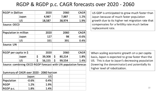
The slide below discloses that over the next 40 years, the US population and economy is anticipated to grow much faster than Japan, mainly due to the US higher net migration.  However, Japan's Real GDP per capita is expected to grow faster than the US.


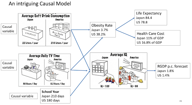
This next slide is an intriguing causal model.  It discloses that Americans drink a lot more soft drinks, watch a lot more TV, and have a far shorter school year than Japanese.  These three indicators may have causal implications on several health metrics: obesity rate, life expectancy, and health care cost.  They may also have implication in overall population IQ and prospective RGP p.c. forecast.

Below, I am just sharing a few references regarding the respective countries' IQ score. 


While the trends reviewed so far favor Japan, the next set of trends related to upper level education reflect a marked competitive advantage for the US. 

The US dominates the ranks of top universities. 


The US also produces a competitive number of Doctorate degrees in science and engineering. 


The US also publishes a competitive number of papers and articles in science and engineering. 


Saturday, October 30, 2021

Health care status and health care costs international comparisons

 This is a review on the subject leveraging the information provided by a presentation titled "Multinational Comparisons of Health Systems Data, 2020" by Roosa Tikkanen and Katherine Fields from The Commonwealth Fund. 

Among developed countries Americans are by far the unhealthiest with: 

a) obesity rates far higher than any of the other shown among OECD countries; and 

b) a far greater % of individuals with multiple chronic conditions.  

On a stand alone basis, an unhealthier population should lead to higher health care costs. 


Because of Americans worse health, the resulting American lifespan is far shorter than among any of the other shown OECD countries.  On a stand alone basis, it may cause health care costs to be relatively lower.  


Americans utilization of health care services seem relatively lower than other OECD countries.  On a stand alone basis, this should translate into lower health care costs. 

On a relative basis, it appears Americans utilize their respective health care systems much less than their international counterparts.  On a relative basis, this should lead to Americans incurring lower health care costs.  

The lower utilization is captured by: 

a) Average number of physicians' visits per capita; and 

b) Average length of stay at hospital.

In summary, if we combine all those factors together, based on the mentioned "inputs" we may expect American health care costs to be somewhat in line with other OECD countries.  In other words, Americans' worse health pushing health care costs upward may be at least partly compensated by Americans lower utilization pushing these same health care costs downward.  

So, next let's see how those health care costs compare.  No matter how you look at it US health care costs are a huge outlier and way higher than the ones of their OECD countries counterparts. 

Of additional concern is that these costs are growing far faster as a % of GDP than for the other countries.  Back in 1980, US health care costs relative to GDP were in line or close to the ones in Germany, and Sweden.  Forty years later, US health care costs relative to GDP are 45% higher than in Germany and 56% higher than in Sweden. 


As shown on graph below, per capita Americans spend a lot more than any of the shown OECD countries.


As shown above, the US Government funded health care costs at around $5,000 are pretty much in line with the other countries.  American out-of-pocket costs (funded by private citizen) is also not that far out of line with other OECD countries.  But, it is the privately funded costs that are way out of line with other countries at over $4,000 per capita vs. much less than $900 for any of the other countries.  

The cause for such high privately funded US costs are multiple.  They include: 

a) US Medical schools are far more expensive.  See comparative costs for a slightly different set of countries from the Medscape International Compensation Report 2019.  Many European countries not shown below have either free Medical schools or provided at a nominal cost. 

b) US doctors earn far more than their counterparts in other countries.  This is in part for their need to recover their much higher cost of education.  See comparative costs for a slightly different set of countries from the Medscape International Compensation Report 2019. 
 

c) The US is the most litigious society.  This is associated with very costly malpractice insurance premium and the need to practice "defensive" medicine which may lead to over testing to protect against malpractice lawsuits.

d) The US large private health care system is "for profit" driven by shareholder returns and other Wall Street driven economic incentives that are often conflicting with what is best for the patient from an effectiveness and efficiency standpoint.  This "for profit" system has also lead to a greater concentration within the hospital industry and related doctors' networks increasing the oligopolistic market price power of such entities. 

e) US regulations are often further exacerbating the private sector health care costs.  For instance, Government programs such as Medicare and Medicaid are prevented from negotiating for lower drug prices.  This is probably unique among OECD countries.   

In conclusion, the US is associated with: 

a) a far unhealthier population (is that just a worst input, or a worst outcome?); 

b) a lower utilization rate of health care services; and 

c) a far more expensive health care sector whose costs are not only far higher than anywhere else; but, they are also increasing far faster.  


The Next 200 Years and Beyond

 Within this study at the link below:

The Next 200 Years,

I envision what the World may look like over the next few centuries from a demographic and economic standpoint (looking both at respective growth and levels). 

If we look at a history of the World from such a perspective, our history is extremely simple.  You need to remember one single data: the onset of the Industrial Revolution at the beginning of the 1800s.


 Over the past 200 years, the World population has increased by 8 times, and the GDP per capita has increased close to 15 times.  Going forward over the next couple of centuries, these respective growth rates will certainly not replicate themselves. 

Looking out several centuries, our respective growth (in both economy and population) are likely to follow the pattern depicted in the graph below. 

From left to right, the graph starts with an S Curve beginning with the Industrial Revolution at the first inflection point of that S Curve.  Next, comes the extraordinary exponential growth over the next 200 years reaching out to the Present.  The latter is on the second inflection of that S Curve associated with a flattening of the mentioned growth.  Going out further to the right, we observe that growth has flattened.  And, it is soon sitting at the first inflection point near the top of a second and smaller inverted S Curve.  Following that curve, some of the growth rates mentioned may even turn negative.  World population is likely to decline and eventually stabilize past the second inflection of the inverted S Curve at some Equilibrium level.  Beyond that point, the respective growth rates (especially demographic growth) are likely to oscillate up and down around the Equilibrium level.  Mind you this process is likely to work itself out over several centuries.  

If you look at the present situation, there is already an abundance of evidence that the growth rates are flattening, if not even declining.  That is especially true for demographic growth.  The fertility rates in the vast majority of the developed World including China is already much below replacement rate (at around 2 children per woman).  Even within the least developed countries (LDCs) where fertility is relatively really high, it has plummeted within the past 60 years or so.  Within the next 100 years, even the LDCs fertility rates may be much below replacement levels.  Similarly, economic growth can't go on forever either.  And, economic growth in much of the developed World including China has slowed down over the past 60 years. 

This begs an interesting question.  What will the stock market be like in 500 years from now.  Over the long term the stock market growth is equal to: demographic + economic growth (per capita) + inflation + speculation.  But, in 500 years from now when we will likely have found an Equilibrium, the only factor left boosting the market will be speculation.  In essence, the stock market will become a Zero-sum game.  We will be betting on specific companies' stocks just like we are betting on a specific horse or basketball team within the sports gambling domain.  Such a stock market could remain viable.  After all, the gigantic derivatives market is very much a Zero-sum game too.   
 

Measuring the Impact of Monetary and Fiscal Policy on the Economy and the Market

This is a study attempting to statistically measure the impact of Government policies on the economy and  the stock market. The “causal” Government policies considered include:


1) Fiscal Policy, entailing Budget Deficit spending;
2) Monetary Policy with the Federal Reserve managing the Federal Funds rate; and
3) Monetary Policy with the Federal Reserve conducting large purchases of securities (Treasuries, MBS);

The dependent or impacted macroeconomic variables affected by the above Government policies will  include:

a) The overall economy (RGDP);
b) Inflation (CPI);
c) Unemployment Rate; and
d) Stock market.
 

        Despite an extensive amount of work, I was truly unable to statistically measure a causal impact of the mentioned causal independent variables (Government policies) on the dependent ones (the economy, the market, etc.).  Nevertheless, I still found doing this statistical exercise very informative.  You can find the work at the following link:  
 

Compact Letter Display (CLD) to improve transparency of multiple hypothesis testing

Multiple hypothesis testing is most commonly undertaken using ANOVA.  But, ANOVA is an incomplete test because it only tells you ...