Tuesday, November 23, 2021

Is the 3-points game taking over NBA basketball

 The short answer is not yet.  The graph below shows that 2-points still make over 50% of overall points.  Granted, 3-points have steadily risen since the 1979-1980 NBA season when 3-points were first introduced in the NBA.  It took a while for the players to adapt their skills and coaches to evolve their strategies to leverage the benefits of 3-points shots. 

 
The big difference over time is how much more aggressive players have become in attempting 3-points shots.  Until the 2011 - 2012 season, teams were attempting less than twenty 3-points shots per game.  The number has exploded to over 35 during the most recent two seasons. 
 

 Something to keep in mind is that the 3-points shooting skill of a team has only a rather moderate to weak relationship with a team's overall performance or ranking.  And, that is another way to consider that 3-points shooting is not dominant in the NBA or even determinant in NBA team's success. 


The graph above (using the NBA 2020-2021 season data) indicates that 3-points ranking of a team explains only 15% of the variance in the overall ranking of a team (R Square = 0.1485) and vice versa.  If 3-points ranking explained 100% of the overall ranking, the red regression trend line would be perfectly diagonal across the squares on the grid.  And, the regression equation would be: y = 1(x) + 0.  Or in plain English: 3-points ranking = Overall ranking.  As shown, this is far from this situation.  
 
Here are the top 5 leaders in 3-points baskets.  

Notice that two of them are still active: Stephen Curry (33 years old), and James Harden (32).  One would expect Curry to soon become the top leader; and, James Harden to move into the third spot.  By the end of their respective career, Curry and Harden may very well occupy the top 2 spots. 

A closer look at the top 5 record on a per game basis. 

What tables A and B indicate is that the contemporary players (Curry and Harden) have been far more productive in scoring 3-pts shots.  And, the main reason behind their success is that they have been far more aggressive in attempting 3-pts shots (see table B). 

In terms of accuracy (table C for 3-pts success rate), Kyle Korver, a player from another generation pretty much towers over the field.  But, his higher success rate did not matter much given that he made so fewer 3-points attempts per game than Curry and Harden (see table B). 

Curry's 3-points talent is in good part not reflected in any of the above statistics.  Curry differentiates himself from the field with his unique ability to score 3-points baskets from "way downtown", often at or even past mid-court.  Unfortunately, this superlative achievement is not rewarded with any scoring points benefits.  

Harden is a very different player.  While nearly as aggressive as Curry in attempting 3-points shots (table B).  He is not nearly as accurate (lower success rate as shown in table C).  In recent seasons, Harden has also somewhat lessened his focus on 3-points shots attempts (table B).  On the other hand, Harden is a very dynamic and diversified player.  And, his claim to fame may not be just his 3-points shooting skills, but his mesmerizing dribbling across his legs in a crouching tiger type position that has rendered him the most "unguardable" player in the NBA.  

Next question worth considering is how long can we expect Curry to perform at top level in 3-points shooting?  

Well, the short answer is for a pretty long time.  The graph below shows the record of Ray Allen, Reggie Miller, and Kyle Korver who rounded the top 5 in 3-points shooting.  We looked at their 3-points success per game (number of baskets) and their related success rate.  The graph shows their respective performance as they aged.  We used the average of their respective performance over 6 seasons when they were from 28 to 33 years old.  We used this average as a baseline index = 100.  And, next we divided each year specific performance by the 28 -33 average and multiplied it by a 100.  This allowed us to measure precisely how their respective performance declined as they aged beyond 33 years old. 


The left hand graph shows that Miller and Korver maintained their 3-points success per game very well as they aged.  At 38 years old, they were still performing at 80% of their average level at 28 to 33 years old. 

The right hand graph shows that all three players maintained their respective 3-points success rate remarkably well as they aged.  Shooting accuracy just does not seem to deteriorate with age.  
 
Curry is now 33.  In view of the above, it is rather likely that he would be very close to or at top form over the next three years (34, 35, 36).  Beyond 36, he may experience a mild decline in 3-points success per game.  But, he may still be relatively formidable in that category compared to other players. 
 
We could say the same thing for Harden (32).  However, Harden has apparently been much less focused on 3-points shooting during the most recent two seasons. 
 
I actually do not follow basketball.  Seeing everyday pictures of Curry on the cover of the sport page of my daily newspaper, I eventually caught Curry fever.  In view of that, I welcome comments, corrections.  And, I would gladly edit and improve this blog entry over time.  
 
If you want to read my complete study on the subject, check the two links below. 


Thursday, November 18, 2021

Is Japan indicative of the future of the US?

Japan leads the US towards a path associated with:
a) a decreasing fertility rate much below replacement rate;
b) an aging society;
c) a declining population growth;
d) a slowing economy; and
e) an increasingly leveraged Public finance position (large Budget Deficits, very high Public/Debt ratio).

However, the two countries are likely to continue diverging materially on several counts:


a) The US population growth is already declining.  But, it is likely to remain positive and much above Japan.  That is because the US benefits from a robust net migration of close to + 1.5% of the population per year vs. only 0.5% for Japan; 


b) Health status and healthcare costs metrics will likely continue to show Japan with far better health outcome associated with far lower health care costs.  This is in good part because of the inputs.  Japanese are far healthier than Americans.  And, these divergences appear likely to continue; 


c) Japan is likely to continue outperforming the US on primary school indicators; 


d) The US is likely to continue outperforming Japan on university level indicators and the generation of science and engineering degrees and papers. 


I have conducted a detailed analysis of all of the above that I share at: 

Study at Slideshare.net

Study at SlidesFinder  

I share these two different platform access options, as I don't know which one is easiest to access.

Below I am sharing just a few of the key slides of this analysis.
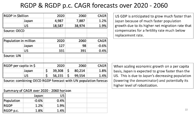
The slide below discloses that over the next 40 years, the US population and economy is anticipated to grow much faster than Japan, mainly due to the US higher net migration.  However, Japan's Real GDP per capita is expected to grow faster than the US.


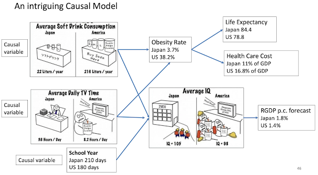
This next slide is an intriguing causal model.  It discloses that Americans drink a lot more soft drinks, watch a lot more TV, and have a far shorter school year than Japanese.  These three indicators may have causal implications on several health metrics: obesity rate, life expectancy, and health care cost.  They may also have implication in overall population IQ and prospective RGP p.c. forecast.

Below, I am just sharing a few references regarding the respective countries' IQ score. 


While the trends reviewed so far favor Japan, the next set of trends related to upper level education reflect a marked competitive advantage for the US. 

The US dominates the ranks of top universities. 


The US also produces a competitive number of Doctorate degrees in science and engineering. 


The US also publishes a competitive number of papers and articles in science and engineering. 


Friday, November 5, 2021

Will we likely keep temperature increase at or below + 1.5 degree Celsius by the end of the Century?

 The short answer is that it is most unlikely that we will be able to do so.  

As we speak our global temperature is already at about 1.1 degree Celsius (over the average from 1850 - 1900).  So, we have only 0.4 degree Celsius to play with. 

Over the past 40 years, our temperature has risen by 0.7 degrees.  If the past is representative of the future, this suggests that over the next 23 years our temperature may very well increase by 0.4 degree over current levels.  And, going forward we would cross the + 1.5 degree threshold.   

This back of the envelope estimate is very much in line with the most recent scenarios generated by the IPCC, as shown below.


It is also in line with a forecast generated by a Vector Autoregression (VAR) model I had introduced in a recent post, as shown below. 

Thus, as described using three completely different methods ranging from rudimentary to pretty complex, we are most likely to run into trouble during the 2040s when we well could cross that + 1.5 degree Celsius threshold. 

One can still advance the argument that going forward everything will change.  We are decarbonising our World economy, etc.  

Well, the U.S. International Energy Agency (IEA) most recent forecast is really not encouraging on this ground.  They foresee a continued rapid rise in CO2 emission that will contribute to ongoing temperature rise. 


Quoting the EIA: 

“If current policy and technology trends continue, global energy consumption and energy-related carbon dioxide emissions will increase through 2050 as a result of population and economic growth.


Oil and natural gas production will continue to grow, mainly to support increasing energy consumption in developing Asian economies.”


If you want more information on this topic, please view the link to my presentation on the subject. 


2100 Temperature Forecast


Tuesday, November 2, 2021

Are we collapsing (in Southern Marin county)?

Jared Diamond, historian and author of “Collapse”, states that civilizations big and small have collapsed in good part because of exhaustion of water resources combined with out-of-control population growth. 

We are following Diamond’s exact recipe for collapsing by doing the following: 

1)    The Marin Municipal Water District (MMWD) Board only opting for building a water pipeline, that they are already planning to dismantle before it is even built to save money when they anticipate we won’t need the pipeline anymore;  

2Many customers of MMWD not willing to cut back on landscape irrigation to preserve the aesthetic and value of their home; 

3)   Because of environmental regulations we are diverting the equivalent of nearly 50% of our entire water consumption from MMWD to save the salmon.  We can’t ruin our local fisheries; and

4)    Sacramento is mandating we build thousands of units for low-income, local working population, and market units to facilitate necessary housing to accommodate the Bay Area job growth.

 Notice that each of the above actions make perfect sense on a stand-alone basis and out of the current context.  In combination, they will contribute to chronic water crises. 

Saturday, October 30, 2021

Health care status and health care costs international comparisons

 This is a review on the subject leveraging the information provided by a presentation titled "Multinational Comparisons of Health Systems Data, 2020" by Roosa Tikkanen and Katherine Fields from The Commonwealth Fund. 

Among developed countries Americans are by far the unhealthiest with: 

a) obesity rates far higher than any of the other shown among OECD countries; and 

b) a far greater % of individuals with multiple chronic conditions.  

On a stand alone basis, an unhealthier population should lead to higher health care costs. 


Because of Americans worse health, the resulting American lifespan is far shorter than among any of the other shown OECD countries.  On a stand alone basis, it may cause health care costs to be relatively lower.  


Americans utilization of health care services seem relatively lower than other OECD countries.  On a stand alone basis, this should translate into lower health care costs. 

On a relative basis, it appears Americans utilize their respective health care systems much less than their international counterparts.  On a relative basis, this should lead to Americans incurring lower health care costs.  

The lower utilization is captured by: 

a) Average number of physicians' visits per capita; and 

b) Average length of stay at hospital.

In summary, if we combine all those factors together, based on the mentioned "inputs" we may expect American health care costs to be somewhat in line with other OECD countries.  In other words, Americans' worse health pushing health care costs upward may be at least partly compensated by Americans lower utilization pushing these same health care costs downward.  

So, next let's see how those health care costs compare.  No matter how you look at it US health care costs are a huge outlier and way higher than the ones of their OECD countries counterparts. 

Of additional concern is that these costs are growing far faster as a % of GDP than for the other countries.  Back in 1980, US health care costs relative to GDP were in line or close to the ones in Germany, and Sweden.  Forty years later, US health care costs relative to GDP are 45% higher than in Germany and 56% higher than in Sweden. 


As shown on graph below, per capita Americans spend a lot more than any of the shown OECD countries.


As shown above, the US Government funded health care costs at around $5,000 are pretty much in line with the other countries.  American out-of-pocket costs (funded by private citizen) is also not that far out of line with other OECD countries.  But, it is the privately funded costs that are way out of line with other countries at over $4,000 per capita vs. much less than $900 for any of the other countries.  

The cause for such high privately funded US costs are multiple.  They include: 

a) US Medical schools are far more expensive.  See comparative costs for a slightly different set of countries from the Medscape International Compensation Report 2019.  Many European countries not shown below have either free Medical schools or provided at a nominal cost. 

b) US doctors earn far more than their counterparts in other countries.  This is in part for their need to recover their much higher cost of education.  See comparative costs for a slightly different set of countries from the Medscape International Compensation Report 2019. 
 

c) The US is the most litigious society.  This is associated with very costly malpractice insurance premium and the need to practice "defensive" medicine which may lead to over testing to protect against malpractice lawsuits.

d) The US large private health care system is "for profit" driven by shareholder returns and other Wall Street driven economic incentives that are often conflicting with what is best for the patient from an effectiveness and efficiency standpoint.  This "for profit" system has also lead to a greater concentration within the hospital industry and related doctors' networks increasing the oligopolistic market price power of such entities. 

e) US regulations are often further exacerbating the private sector health care costs.  For instance, Government programs such as Medicare and Medicaid are prevented from negotiating for lower drug prices.  This is probably unique among OECD countries.   

In conclusion, the US is associated with: 

a) a far unhealthier population (is that just a worst input, or a worst outcome?); 

b) a lower utilization rate of health care services; and 

c) a far more expensive health care sector whose costs are not only far higher than anywhere else; but, they are also increasing far faster.  


Medicare Plans?

 This is a quick review of some of the considerations when selecting Medicare plans.  At various Medicare plan selection websites or other Medicare information communications, I have observed Medicare plans being either differentiated between: 

a) Medicare Part G or N vs. Medicare Advantage; or

b) Medicare Gap vs. Medicare Advantage; or

c) Medicare Supplemental plans vs. Medicare Advantage. 

As you can anticipate, Medicare Part G or N, Medicare Gap, and Medicare Supplemental plans must be somewhat synonyms or closely related. All of these typically are plans that are attached to supplement Medicare's basic primary health care coverage.  That is certainly the case for Part G or N.  The latter two are identical except that Part G typically charges no copay for primary care office visits, meanwhile Part N does charge a small copay in exchange for lower premium.  

All these mentioned plans (Medicare Part G or N, Medicare Gap, and Medicare Supplemental plans), I think do not include any dental, vision, and drug coverage.  You typically buy this additional coverage separately.  Going forward, I will call all these plans the disaggregated plans. 

Medicare Advantage plans pretty much stand alone in their category.  They actually package and include all coverage into one single insurance plan (including, dental, vision, drug).  We could call it an aggregated plan vs. the disaggregated plans, but I will simply keep their current name Medicare Advantage.  

Medicare Advantage has numerous huge advantages.  They are far cheaper.  They often charge no premium at all, and they include the other mentioned coverage (dental, vision, drug).  The disaggregated plans will often cost you $100 or more per month for the supplemental health coverage alone.  When you include the additional coverage (vision, drug, dental), you may well have total monthly premiums of $200 or more. 

However, there are a couple of considerations to watch out for with Medicare Advantage plans.  

The first one is that the additional coverage included in Medicare Advantage is most often really minimal.  It is both minimal in coverage amount and minimal in access.  I personally have a Medicare Advantage plan, and the dental insurance component did not include a single dentist in the town were I live.  We have about 10 of them.  I did not have access to a single one.  As a result, I ended up buying a separate dental insurance just as if I had bought a Medicare disaggregated plan to begin with.  Similarly, the drug coverage was really poor.  So, I ended up getting a free Easy Drug Card at easydrugcard.com, where I could get drugs at a much cheaper price than on my Medicare Advantage drug coverage. 

The second consideration is that a Medicare Advantage plan is truly different than Medicare.  

With a Medicare disaggregated plan, Medicare is the primary insurer.  And, whatever private insurance you have (Aetna, Blue Cross, United Healthcare) acts as the secondary insurer.  What that means is that whether any provider is within network or not of the secondary insurer, you can still use Medicare and typically get 80% coverage at any provider. 

The above is not true for Medicare Advantage.  Such plans are whereby Medicare has contracted with a private insurer to pretty much outsource the entire administration of healthcare coverage.  In such a case, the private insurer is the primary insurer, and Medicare the secondary.  What that means is that the private insurer network entirely controls your access to providers whether they accept Medicare or not.  I learned this the hard way.  I suffered a severe bike accident recently.  And, I needed physical therapy.  Within our town we are blessed with an abundance of excellent physical therapist offices with top Yelp reviews.  They all accepted Medicare on a stand alone basis.  So, I could have had access to those with at least an 80% coverage with any Medicare disaggregated plan.  But, I did not have access to any of the top ones with my Medicare Advantage plan.  With the latter, I had only access to a single PT office that had really pretty low ratings.  This was because the PT place was not "in network" of my primary insurer.  

Overall, am I upset with my Medicare Advantage plan?  No, not really.  I would even say that it is really good.  Even when I factor that I had to purchase dental insurance, my total monthly premium (on top of Medicare) is far lower than it would be with any Medicare disaggregated plan alternative.  My limited to access to PT place was definitely an impediment.  But, this PT place is actually pretty good.  Their lower Yelp ratings were due to billing issues, that are often not that difficult to resolve.       

The Next 200 Years and Beyond

 Within this study at the link below:

The Next 200 Years,

I envision what the World may look like over the next few centuries from a demographic and economic standpoint (looking both at respective growth and levels). 

If we look at a history of the World from such a perspective, our history is extremely simple.  You need to remember one single data: the onset of the Industrial Revolution at the beginning of the 1800s.


 Over the past 200 years, the World population has increased by 8 times, and the GDP per capita has increased close to 15 times.  Going forward over the next couple of centuries, these respective growth rates will certainly not replicate themselves. 

Looking out several centuries, our respective growth (in both economy and population) are likely to follow the pattern depicted in the graph below. 

From left to right, the graph starts with an S Curve beginning with the Industrial Revolution at the first inflection point of that S Curve.  Next, comes the extraordinary exponential growth over the next 200 years reaching out to the Present.  The latter is on the second inflection of that S Curve associated with a flattening of the mentioned growth.  Going out further to the right, we observe that growth has flattened.  And, it is soon sitting at the first inflection point near the top of a second and smaller inverted S Curve.  Following that curve, some of the growth rates mentioned may even turn negative.  World population is likely to decline and eventually stabilize past the second inflection of the inverted S Curve at some Equilibrium level.  Beyond that point, the respective growth rates (especially demographic growth) are likely to oscillate up and down around the Equilibrium level.  Mind you this process is likely to work itself out over several centuries.  

If you look at the present situation, there is already an abundance of evidence that the growth rates are flattening, if not even declining.  That is especially true for demographic growth.  The fertility rates in the vast majority of the developed World including China is already much below replacement rate (at around 2 children per woman).  Even within the least developed countries (LDCs) where fertility is relatively really high, it has plummeted within the past 60 years or so.  Within the next 100 years, even the LDCs fertility rates may be much below replacement levels.  Similarly, economic growth can't go on forever either.  And, economic growth in much of the developed World including China has slowed down over the past 60 years. 

This begs an interesting question.  What will the stock market be like in 500 years from now.  Over the long term the stock market growth is equal to: demographic + economic growth (per capita) + inflation + speculation.  But, in 500 years from now when we will likely have found an Equilibrium, the only factor left boosting the market will be speculation.  In essence, the stock market will become a Zero-sum game.  We will be betting on specific companies' stocks just like we are betting on a specific horse or basketball team within the sports gambling domain.  Such a stock market could remain viable.  After all, the gigantic derivatives market is very much a Zero-sum game too.   
 

Compact Letter Display (CLD) to improve transparency of multiple hypothesis testing

Multiple hypothesis testing is most commonly undertaken using ANOVA.  But, ANOVA is an incomplete test because it only tells you ...