Sunday, August 21, 2022

CalPERS Pensions vs. Social Security

Employees from schools and local and State agencies were carved out of the Social Security system since the first half of the 20th century.  Instead, they receive public pensions funded by State taxpayers.  This has had material financial implications for school districts and local and State agencies nationwide.  

Here I am focused on the California Public Employees' Retirement System (CalPERS), the largest public pension fund in the US, that manages the pensions for 1.5 million California public employees.  

I also give a close look at the related pension financial burden on the Marin Municipal Water District (MMWD).  This is the Water District where I live.  And, as we shall soon observe the related CalPERS financial burden on the MMWD does not appear sustainable.  This is a concern given that the MMWD needs to undertake major projects to increase its water supply.  These projects would require large bond issuances which could be compromised by the mentioned pension financial burden.  

You can see the complete study at the following URLs: 

Pension study at Slideshare 

Pension study at Slidesfinder 

CalPERS pensions and Social Security are very different on several counts. 

First, Social Security is very progressive.  Higher earners have proportionally far lower pensions than lower earners.  The graph below shows how high earners making $140 K have far lower salary replacement rates than lower earners at any age ranging from retiring at 62 to as late as 70 (the oldest age allowing for accrual of Social Security benefits.    

I calculated all above estimates using a really handy tool.  

Social Security Quick Calculator 

CalPERS pensions do not work like Social Security.  They are not progressive.  Instead, they are neutral.  Their pension salary replacement rate in % is not affected by salary level.  Additionally, CalPERS pensions are a lot more generous than Social Security as shown on the tables below.  Indeed, the CalPERS salary replacement rates are invariably a lot higher than Social Security, regardless of age and salary. 

Another way to measure how much more generous are CalPERS pensions is to look at the multiple of replacement rate (CalPERS divided by Social Security, respective replacement rates).  As shown, on the tables below, CalPERS pensions are 2.5 to 4.1 times as generous as Social Security.  


 Of course such pension generosity does not come free.  And, the majority of the financial burden is on the public employers (ultimately the State taxpayers).  The CalPERS pensions funding requirements on public employers is about 4 times greater than for private employers Social Security funding requirements.

CalPERS projections of employers' funding requirements are highly volatile and sensitive to recent market trends.  Last year, CalPERS forecasted that such funding requirements would rapidly increase over the next few years.  A year later, they completely reversed that trend.  Who knows what their forecasts will be over the next few years.  

If we now focus on the MMWD, we can observe that the CalPERS financial burden does not appear sustainable. 


From 2015 to 2021, the MMWD pension contribution rose very rapidly from 23.3% to 38.7% of payroll.  Yet, these increases in pension contributions were not enough as the related unfunded pension liabilities kept on rising from 13.4% of the balance sheet in 2015 to 18.8% in 2021. 

If public employees would have remained within the Social Security system, the MMWD's finances would be in far better shape nowadays.  The table below compares the actual MMWD's financial condition in fiscal 2021 with CalPERS pensions vs. what it would be if its pensions were within the Social Security system.  As can be seen on all specific counts of financial conditions, the MMWD would have been far better off with the Social Security system.  It has no choice in this matter.  But, it is interesting to uncover the drastic difference in the financial burden of the two very different pension systems.   


Thursday, August 11, 2022

How to measure your blood pressure

Why blood pressure measurements at your doctor's office are imprecise

The blood pressure measurements you get at a doctor's office may not be representative because:

1) In a doctor's office you are nervous, and that can cause blood pressure to spike;

2) They typically take just one single reading.  Blood pressure is volatile.  You need to take at least 3 measurements and take the average to derive a more representative measure of blood pressure; 

3) It is critical to take the blood pressure on each arm.  The blood pressure in each arm is different.  And, this difference is informative.

Blood pressure standards.  The ones from the NHS are pretty good

Unlike American standards, the UK's NHS does not go crazy the minute your blood pressure is over 120/80.  Also, the NHS is concerned about low blood pressure.  American standards typically are not, a material omission. 

So, here are the NHS blood pressure standards.

Take 3 measurements in each arm, and observe the difference between arms

Next is an example of a basic blood pressure reading (3 measurements in each arm, and calculating the difference between the arms, and the averages). 


 The above overall average blood pressure is 130/83 which falls within normal range (NHS).  When we look at the data for each arm, we notice a very large difference between the two arms.  It turns out that this difference is very informative.  The table below discloses the interpretation of this difference.

The difference between the arms tells you what type of cardiovascular condition the patient may have, what event he may incur, and what is the location of the blocked vessels (the side with the lower blood pressure).  

When I use "may" it indicates the statement is uncertain.  It is not deterministic.  But, the blood pressure measurements inform the cardiologist on what test to conduct to confirm the presence of the mentioned condition.   

Next, look at the difference between Systolic and Diastolic pressure

The difference between the systolic and diastolic pressure is called Pulse Pressure (PP).  The ratio of the PP divided by the systolic pressure (PP/S) is also of interest.  Let's take an example. 

The table below discloses the interpretation of the PP metrics.  Notice the frequent use of "may" conveying uncertainty.  However, it suggests the PP information can raise hypotheses regarding numerous cardiovascular ailments.
The described patient has good pulse pressure measurements which do not raise explicit concerns. 

You may also consider observing the difference between arm and ankle blood pressure

The difference between your arm and ankle blood pressures is the ankle-brachial pressure index (ABPI).  This measurement requires special equipment conducted in a doctor's office.  For more detail on this test, check Wikipedia.  

Nevertheless, I would venture that taking 6 measurements at home (without the precise equipment) may be as representative as taking one single measurement at a doctor's office.  

See below the table interpreting the ABPI (source: Wikipedia). 

An ABPI between 0.90 and 1.29 is considered normal, free from peripheral vascular disease (PVD), while a lesser than 0.9 indicates arterial disease.   

An ABPI of 1.3 or greater is high, and suggests calcification of the walls of the arteries and incompressible vessels, reflecting severe PVD. 

How about the plain Pulse Rate... It is about Atrial Fibrillation

Blood pressure monitors disclose the pulse rate (heartbeat per minute).  On a stand alone basis, it is not informative.  However, the pulse rate is the marker for atrial fibrillation (A-fib), irregular, and rapid heartbeat.  If left untreated, it can lead to serious cardiovascular events and cognitive impairment.  For more details on A-fib, go to Wikipedia. 


So, how can you test yourself for A-fib?  Anyone who has a Fitbit, Smartwatch, or Oura ring can observe their pulse rate trend throughout the night.  Any spiking deviation in pulse rate will be readily noticeable.  And, it may suggest one has A-fib.  During the day, such measurements are less precise because any activity readily affects our pulse rate.      

Tuesday, June 21, 2022

Are we already in a recession?

2022 Q1 GDP growth was already negative.  And, 2022 Q2 may very well be [negative] when the released data comes out. 


The majority of the financial media believes we are already in a recession because of the stubbornly high inflation (due to supply chain bottlenecks) and the Federal Reserve aggressive monetary policy to fight inflation.  The policy includes a rapid rise in short-term rates, and a reversing of the Quantitative Easing bond purchase program (reducing the Fed’s balance sheet and taking liquidity & credit out of the financial system).  The Bearish stock market also suggests we are currently in a recession. 


On the other hand, Government authorities including the President, the Secretary of the Treasury (Janet Yellen), and the Federal Reserve all believe that the US economy can achieve a “soft landing” with a declining inflation rate, while maintaining positive economic growth.  


The linked presentations include two explanatory models to attempt to predict recessions.  


Recessions at Slideshare.net 

Recessions at SlidesFinder  


The first one is a logistic regression.  The second one is a deep neural network (DNN).  Both use the same set of independent variables: the velocity of money, inflation, the yield curve, and the stock market.  


A copy of one of the slides describes the Logistic Regression model below.


A foundational equality: Price x Quantity = Money x Velocity of money


The logistic regression to predict regression includes Price (cpi) and Velocity (velo).  As the CPI goes up, the probability of a recession increases and vice versa.  As the velocity of money goes up the probability of a recession decreases and vice versa. 


This model also includes the yield curve, a well established variable to predict recession.  Notice that this variable is not quite statistically significant (p-value 0.14).  But, the sign of the coefficient is correct.  It does inform and improve the model.  And, is well supported by economic theory.  When the yield curve widens the probability of a recession goes down and vice versa.

The model includes the stock market (S&P 500) that is by nature forward looking in terms of economic outlook.  This makes it a most relevant variable to include in a regression model to predict recessions.  When the stock market goes up, the probability of a recession goes down and vice versa. 

The deep neural network (DNN) model is described below.

 The DNN model uses the same explanatory variable inputs.  

The DNN model has two hidden layers with 3 neurons in the first one, and 2 neurons in the second one. 

Number of neurons is nearly predetermined as hidden layers must have fewer neurons than the input layer and more neurons than the output layer. 


The activation function is Sigmoid, which is the same as a Logistic Regression.  And, the output function is also Sigmoid.  This makes this DNN consistent with the Logistic Regression model.  


I noticed that when using the entire data (from 1960 to the present using quarterly data), ROC curves and Kolmogorov - Smirnov plots did not differentiate between the two models.  I am just showing the KS plots below.  The two plots are very similar, not allowing you to clearly rank the models. 


The next set of plots more clearly differentiate between the two models.  


On the plots above, the recessionary quarters are shown in green, and the others are shown in red.  You can see that the DNN generates nearly ideal probabilities that are very close to 1 during a recession, and very close to Zero otherwise.  The Logistic Regression model generates a much more continuous set of probabilities within the 0 to 1 boundaries.  Notice that both models do make a few mistakes with green dots (indicating recessions), when they should be red.  

The graph above displays how much more certain the DNN model is.  


All of the above visual data was generated using the entire data set.  Next, we will briefly explore how the models fared when predicting several recessionary periods treated as Hold Out or out-of-sample if you will. 


Let's start with the Great Recession. 


As shown above, during the Great Recession period, the Logistic Regression was a lot better at capturing the actual recessionary quarters.  It captured 4 out of 5 of them vs. only 2 out of 5 for the DNN. 

Next, let's look at the COVID Recession period. 


The above shows a rather rare occurrence in econometrics modeling, a perfect prediction.  Indeed, both models with much certainty predicted all 6 quarters of this COVID Recession period correctly.  And, as a reminder, these 6 quarters were indeed treated out-of-sample. 

Next, we will use a frequentist Bayesian representation of both models when combining all the recession periods we tested (on an out-of-sample basis).


We can consider that recession is like a disease.  And, given a disease prevalence, a given test sensitivity and specificity, we can map out the actual accuracy of a positive test or a negative test.  Below we are doing the exact same thing treating recession as a disease.  


Here is the mentioned representation for the Logistic Regression.


As shown above, during the cumulative combined periods there were 13 recessionary quarters out of a total of 30 quarters.  And, the Logistic Regression model correctly predicted 10 out of the 13 recessionary quarters. 


 And, now the same representation for the DNN.


   A table of these accuracy measures is shown below.


When you use the entire data set, the DNN is marginally more accurate.  When you focus on the recessionary periods on an out-of-sample basis, the two models are very much tied.


So, can these models predict the current prospective recession? 


No, they can’t.  That is for a couple of reasons: 


First, both models have already missed out 2022 Q1 as a recessionary quarter.  Even using the historical data (not true testing), the Logistic Regression model assigned a probability of a recession of only 6% for 2022 Q1; and the DNN assigned a probability of 0%.  Remember, the DNN is always far more deterministic in its probability assessments.  So, when it is wrong, it is far more off than the Logistic Regression model. 


Second, for the models to be able to forecast accurately going forward, you would need to have a crystal ball to accurately forecast the 4 independent variables.  And, that is a general shortcoming of all econometrics models. 


Thursday, June 2, 2022

Inequality in the United States

I used the data provided by the US Government Survey of Consumer Finance (SCF) that publishes its data set every 3 years ranging from 1989 to 2019. 

Using this data I explored trends in inequality along several dimensions including: education, work status, and ethnicity.  I did not study gender because the SCF data is aggregated at the families level (similar to households).  

You can see the complete study at the following links: 

Inequality at Slideshare.net 

Inequality at Slidesfinder

I looked at several different variables to identify inequality including: net worth, pre-tax income, and stock holdings.

And, I measured inequality between different groups by looking at their difference at the median level.  I focused on the median, instead of the mean, in order to factor out the net worth of billionaires and other high-net worth families, that skew the mean or average value.  I call this phenomenon the Elon Musk effect.  And, I wanted to be sure to factor it out when dealing with between-differences. 

For instance, comparing the net worth of college grads vs. high school grads, I compared their respective median net worth as shown below. 


Notice how on an inflation adjusted basis, the net worth of high school graduate families remained under $75K in 1989 and 2019.  

Next, I graphed the multiple between the median net worth of college grads divided by the median net worth of high school grads.  And, I observed the trend over time of this multiple as shown below. 


The graph above indicates that this between-difference has increased since 1995.  It peaked in 2013.  And, it has somewhat mean-reverted to around 4 times, where it has been since 2001.  

The above gives us a pretty good take on inequality or between-difference between college grads and high school grads families in term of their respective net worth. 

But, how about inequality within a group.  For that, I looked at the within-difference for college grads (in this example).  And, now I focus on the multiple between the average or the mean divided by the median.  Now, I do want to include the Elon Musk effect because I want to measure the inequality within a group.    So, let's look at the data. 


Next, let's visualize this college grad's net worth Mean/Median multiple over time. 


As shown, this within-difference Mean/Median multiple has fairly much steadily risen over time.  One may think that this trend is pretty much due to the rising long term trend in the stock market.  It actually is not.  The two do not track closely (the two diverge markedly from 1989 to 2001; from 2007 to 2010; from 2016 to 2019). 


The linked studies cover inequality in a similar fashion for ethnicity, work status; and along net worth, pre-tax income, and stock holdings.  I expected the inequality trends in stock holdings to be closely related to stock market movements.  And, for the most part, they really were not.  

As an additional information gathering, the SCF data allowed me to evaluate the financial readiness for retirement of 55 - 64 year old families.  Here we focused on families retirement funds.   


Currently, a 60 year old is expected to have a remaining life expectancy of 21 years.  Given that, the 55 - 64 year old families retirement funds, whether you focus on the mean or the median, seem grossly inadequate to support a comfortable and secure retirement.  This is a stealthy fiscal nationwide crisis that remains unaddressed.  It is unclear what the solution is given the fiscal pressures at all levels of Government.    


Tuesday, May 24, 2022

Overfitting with Deep Neural Network (DNN) models

 I developed a set of models to explain, estimate, and predict home prices.  My second modeling objective was to benchmark the accuracy in testing (prediction) of simple OLS regression models vs. more complex DNN model structures.  

I won't spend any time describing in much detail the data, the explanatory variables, etc.  For that you can look at the complete study at the following links.  The study is pretty short (about 20 slides). 

Housing Price models at Slideshare

Housing Price models at Slidesfinder 

Just to cover the basics, the dependent variable is home prices in April 2022 defined as the median county zestimate from Zillow, that I just call zillow within the models.  The models use 7 explanatory variables that capture income, education, innovation, commute time, etc.  All variables are standardized.  But, final output is translated back into nominal dollars using a scale of $000.

The models use data for over 2,500 counties. 

I developed four models:

1. A streamlined OLS regression (OLS Short) that uses only three explanatory variables.  It worked as well as any of the other models in testing/predicting; 

2. An OLS regression with all 7 explanatory variables (OLS Long).  It tested & predicted with about the same level of accuracy as OLS Short.  But, as specified it was far more explanatory (due to using 7 explanatory variables, instead of just 3); 

3. A DNN model using the smooth rectified linear unit activation function.  I called it DNN Soft Plus.  This model structure had real challenge converging towards a solution.  Its testing/predicting performance was not any better than the OLS regressions; 

4.  A DNN model using the Sigmoid activation function (DNN Logit).  And, this model will be the main focus of our analysis regarding overfitting with DNNs.   

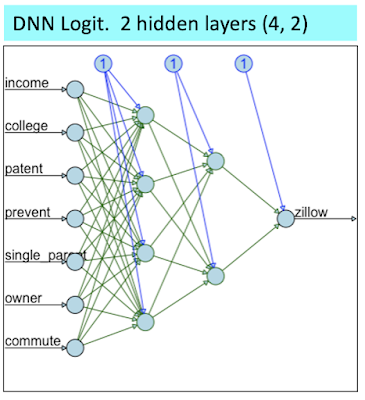
The DNN Logit was structured as shown below: 

I purposefully structured the above DNN to be fairly streamlined in order to facilitate convergence towards a solution.  Nevertheless, this structure was already too much for the DNN Soft Plus (where I had to prune down the hidden layers to (3, 2) in order to reach mediocre convergence (I also had to rise the error level threshold).  

When using the entire data set, the Goodness-of-fit measures indicate that the DNN Logit model is the clear winner. 

You can also observe the superiority of the DNN Logit visually on the scatter plots below. 

On the scatter plot matrix above, check out the one for the DNN Logit at the bottom right; and focus on how well it fits all the home prices > $1 million (look at rectangle defined by the dashed red and green lines).  As shown, the DNN Logit model fits those perfectly.  Meanwhile, the 3 other models struggle in fitting any of the data points > $1 million. 

However, when we move on to testing by creating new data (splitting the data between a train sample and a test sample), the DNN Logit performance is mediocre. 


 As shown above when using or creating new data and focusing on model prediction on such data, the DNN Logit predicting performance is rather poor.  It is actually weaker than a simple OLS regression using just 3 independent variables.  

Next, let's focus on what happened to the DNN Logit model by looking how it fit the "train 50%" data (using 50% of the data to train the model and fit zestimates) vs. how it predicted on the "test 50%" data (using the other half of the data to test the model's prediction). 

As shown in training, the DNN Logit model perfectly fit the home prices > $1 million.  At such stage, this model gives you the illusion that its DNN structure was able to leverage non linear relationships that OLS regressions can't.  

However, these non linear relationships uncovered during training were entirely spurious.  We can see that because in the testing the DNN Logit model was unable to predict other home prices > $1 million within the test 50% data.   

The two scatter plots above represent a perfect image of model overfitting.  


Thursday, May 12, 2022

Is the Market Rigged (Part II)?

 This is a follow up to my earlier blog post on the subject a few days ago.  To remind ourselves, our starting point was the following chart from the Bespoke Investment Group that indicated that the entire accrued value of the S&P 500 since 1992 was captured by After Hours traders (who bought the S&P 500 after the Close the previous day and sold it at the Open on the following day), and that the "during regular hours traders" (who bought the S&P 500 at the Open and sold it at the Close of the market on a daily basis), did not capture any of the upward movement in the S&P 500 since 1992. 


At the time, I was skeptical  that the After Hours traders would reap 100% or more of the gains in the S&P 500.  And, I replicated this graph using data from Yahoo Finance.  And, I uncovered that the Bespoke Investment Group (BIG)  simply confused one variable for another.  And, after making the appropriate correction, the World still made sense.  And, contrary to what BIG disclosed, the vast majority of the gains were actually captured to the traders during market hours as one would expect as shown on my chart below. 


Readers of the first blog post on the subject a few days ago invited me to give the data a second and more detailed look at the data.  When I did that, I uncovered that there is a divergent period from September 2016 to the present, when the majority of the gains actually do flow to the After Hours traders.  And, the chart below reflecting this visual data looks very similar to the original BIG chart (but using a truncated time period). 


In the chart above, over the reviewed period, even after using accurate data the vast majority of the gains in the S&P 500 do accrue to the After Hours traders.  I find that rather dismaying.  And, after doing a bit of research based on hypotheses generated by readers, I could find an explanation.  There are a lot of breaking news during the After Hours period.  Companies are allowed to release quarterly earnings after the market Close and before the market Open.  Similarly, the majority of economic indicators releases are disclosed by the Government before the market Open.  Given that, it makes much sense that the After Hours traders would reap the gains.  

Now, is the market rigged?  I find this question really uncomfortable because I find it rather challenging to answer this question in the negative.  The timing of breaking news disclosure favors the large institutional investors over the retail investors that trade mainly during regular trading hours.

However, I have no explanation why this phenomenon (advantage of institutional investors trading After Hours) kicked in only since September 2016.  

Yet, I am concerned that once this advantage has been captured by institutional investors, it will propagate going forward forever. 

On the other hand, I am still comforted that a simple Buy & Hold strategy still performs a lot better than the daily After Hours strategy, as shown on the chart below. 


 The simple Buy & Hold strategy holds several "efficient" advantages over the After Hours trading, including: 

1) Operating efficiency.  Buy & Hold foregoes having to make 506 trades a year (253 trading days times 2 trades per day); 

2) Buy & Hold value accretion is not impaired by bid-ask spreads.  The latter materially affects the After Hours traders' value accretion, that is not shown on this graph (absence of data); and 

3) Tax efficiency.  The After Hours traders gains are 100% taxable as ordinary income.  The Buy & Hold traders have unrealized capital gains that are not taxable.  And, they will be taxable only when realized at much lower capital gains tax rates.  

More often than not, the Buy & Hold strategy over a long period of time will perform better than After Hours trading; that is because Buy & Hold gains = After Trading Hours gains + Regular Hours gains + compounding effect.  For instance, since September of 2016, when After Trading Hours performed well, it captured 80% of the gains of the Buy & Hold strategy.  During Regular Hours trading captured 10%.  And, the compounding effect captured the remaining 10%.  

Monday, May 9, 2022

Is the Market rigged?

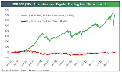
 A friend of mine recently shared this arresting chart.


The above chart suggests that since the beginning of 1993, some large institutional investors extracted all the gains out of the S&P 500 by simply buying it at the Close of the previous day and selling it at the Open of the following day.  Meanwhile, many retail investors (day-traders types) who would simply buy the S&P 500 at the Open and sell it at the Close during regular trading hours would have reaped no gain whatsoever going back to 1992!  

The chart above was created by the Bespoke Investment Group.  You can review their website at the link below.

Bespoke Investment Group  

For a better understanding of After Hours Trading, please refer to the following link. 

After Hours Trading explanation

The above chart left me baffled.  So, I extracted the relevant data from Yahoo Finance.  And, I replicated this chart.  And, all of a sudden the World still made sense.  And, the Market is not rigged (at least on this one count).  


As you can see on my chart above, the gains in the S&P 500 accrue to the ones who simply bought it at the Open and sold it at the Close during the regular trading hours.  Meanwhile, the ones who would have traded after hours, overall did not reap any gain whatsoever.  My chart looks very much like the one from Bespoke, except that in my chart the gains are associated with the regular trading hours.  I gather, Bespoke simply confused the time series for After Hours Trading vs. Regular Hours Trading.  

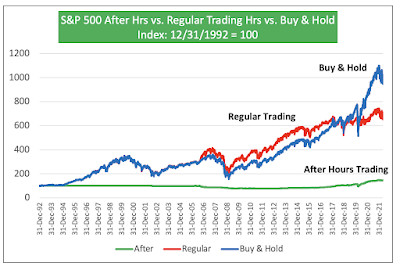
Next, I just added an extra time series to see how those strategies would compare vs. simply a Buy & Hold strategy.  

As shown above, you can see that from beginning to end point, the Buy & Hold strategy is way ahead. 

However, most of that advantage occurred in the past couple of years since the beginning of 2020 (blue line spikes upward much above the red line).  During this period, the After Hours traders made some marginal gains (the Market on the next day at the Open was at times marginally higher than the Close of the previous day).  And, those small gains compounded on a larger accrued value for the Buy & Hold strategy, allowed it to zoom passed the regular trading hour strategy. 

The reverse was true during a long period from the end of 2006 to end of 2014, when the Buy & Hold strategy was hindered by the small losses in the S&P 500 between the Close of the previous day and the Open of the following day.  During that period, you can see the red line (regular trading) steadily above the blue line (Buy & Hold).  Afterwards, the two lines start to converge. 

From the end of 1992 till the end of 2006, there was virtually no difference between Buy & Hold and Regular Trading hours (the blue and red lines overlap, so you just see the blue one).  This entails that throughout that period, the S&P 500 opened the next day at the exact same value as the Close on the previous day. 

Once you convey the S&P 500 data accurately, there is nothing that suggests that institutional investors who trade after hours extract any rent-profits from the Market.  

Although this was not the main topic of this post, you have to note the superior efficiency of the Buy & Hold strategy on several counts.  And, the "efficiency" has several dimensions.  

First, from an operational standpoint, the Buy & Hold strategy allows you to avoid 506 trades per year (253 trading days x 2 trades per day).  

Second, it is a lot more tax efficient.  All the accrued value represents not taxed unrealized capital gains.  Meanwhile, all gains under the other two strategies would be taxed as short-term gains at ordinary income tax rates.  

Compact Letter Display (CLD) to improve transparency of multiple hypothesis testing

Multiple hypothesis testing is most commonly undertaken using ANOVA.  But, ANOVA is an incomplete test because it only tells you ...